
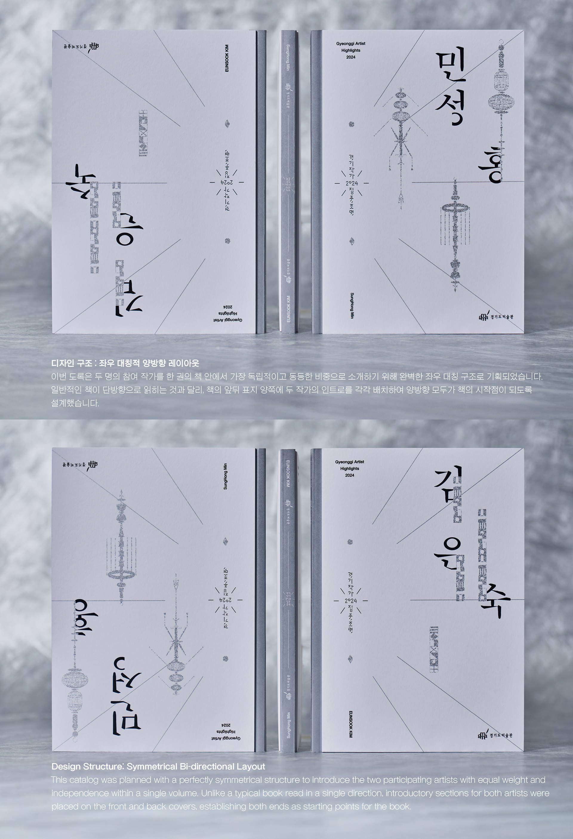
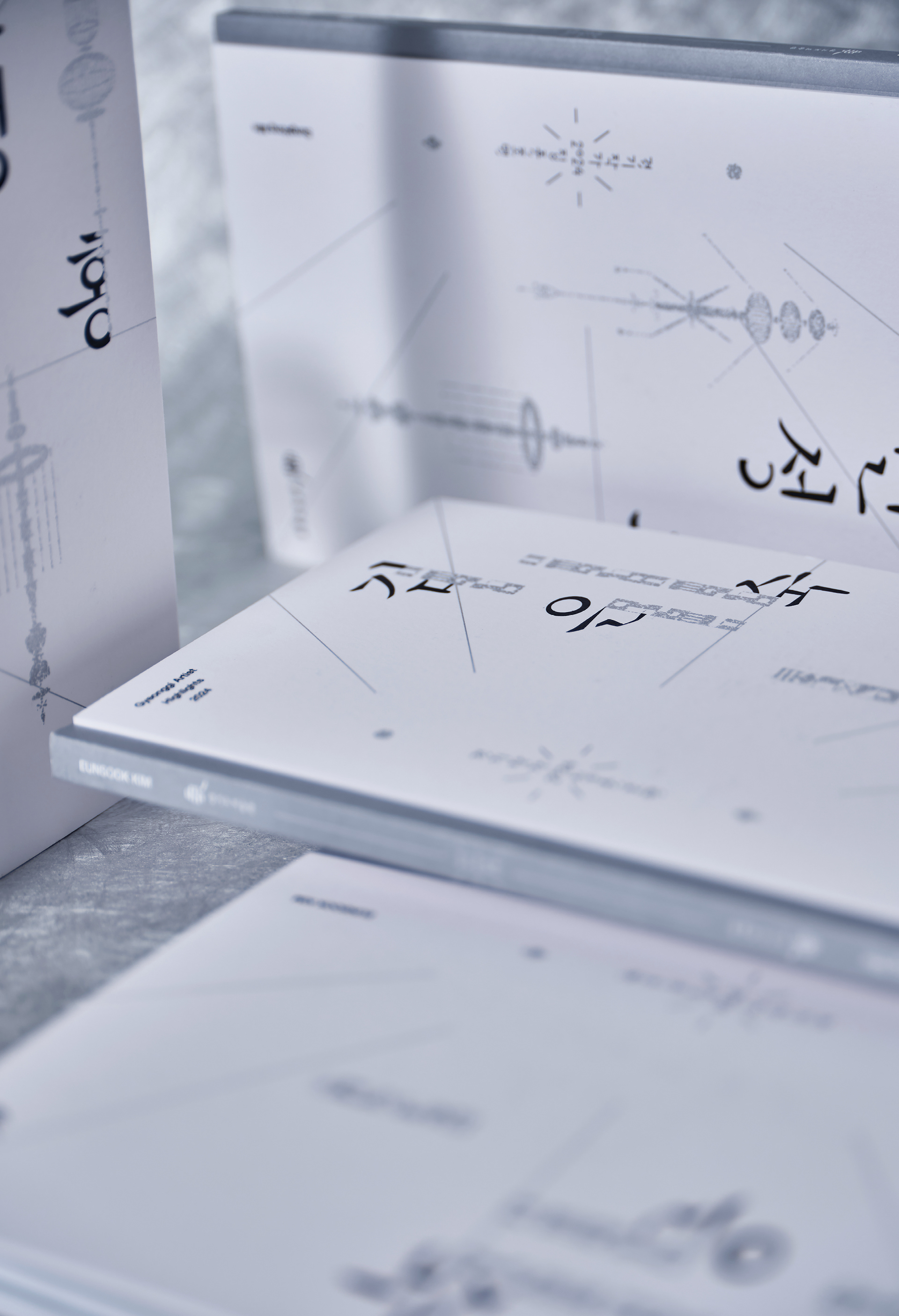
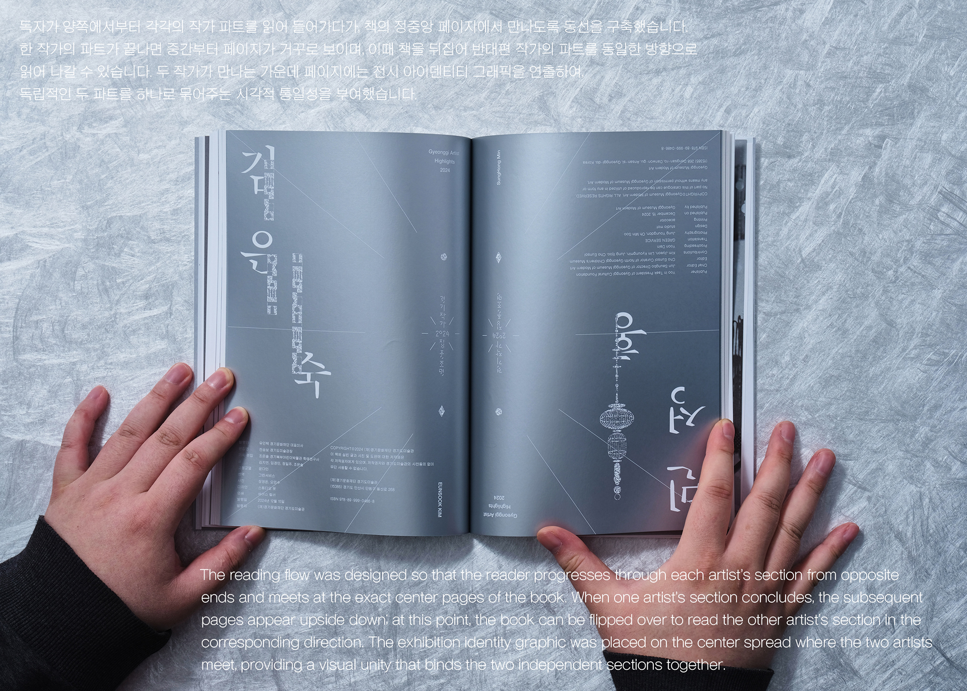

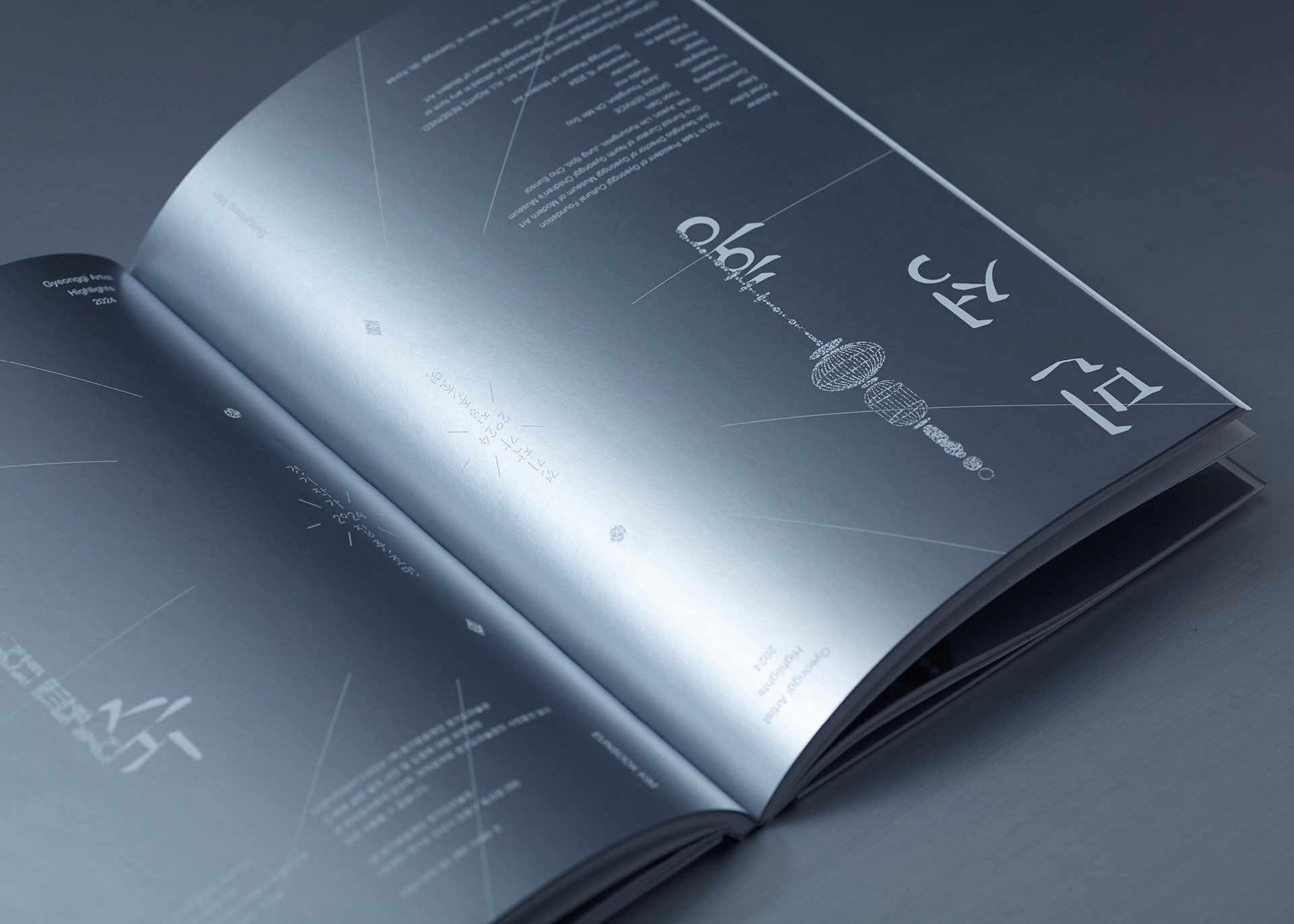
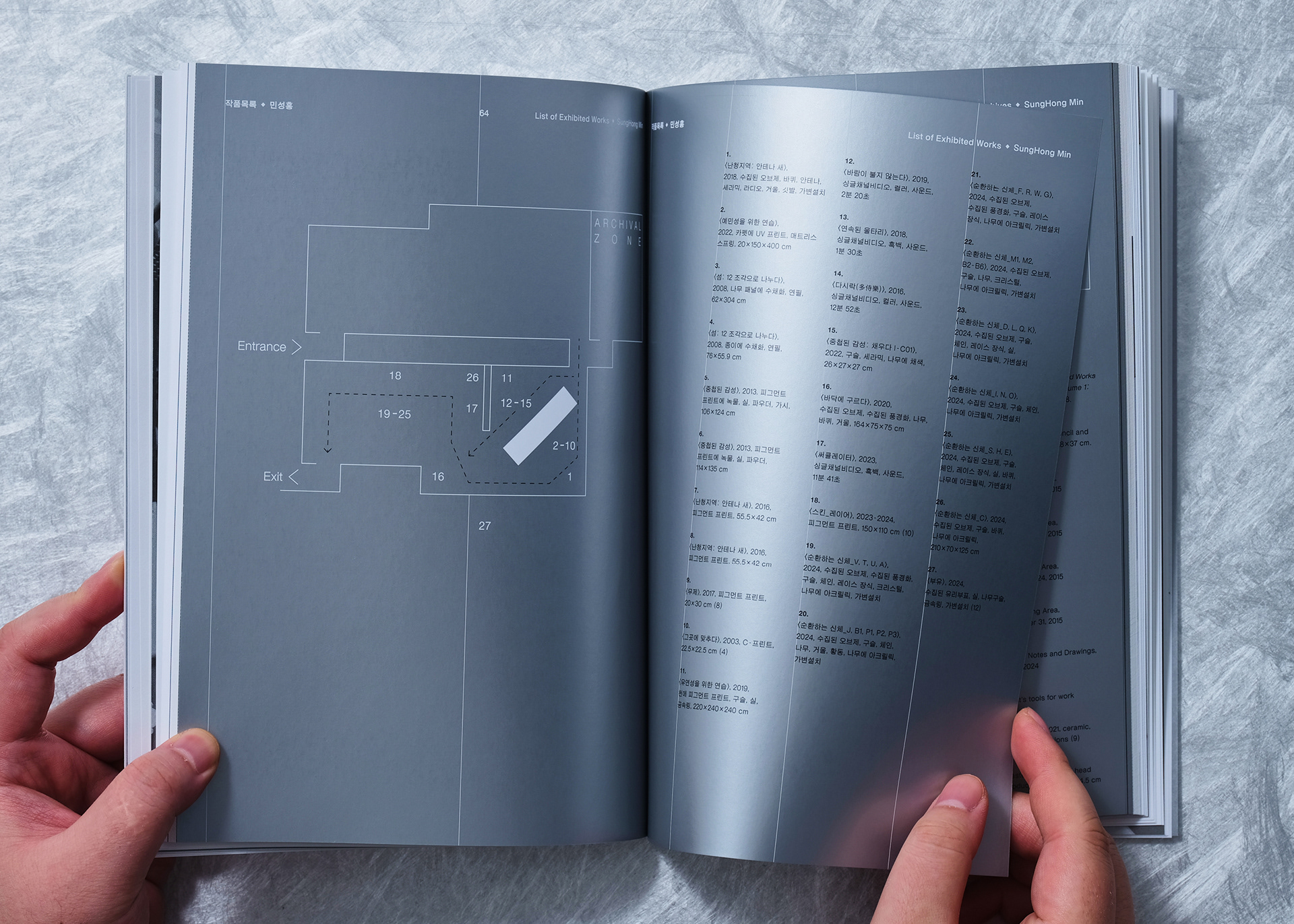
디자인 구조 : 좌우 대칭적 양방향 레이아웃
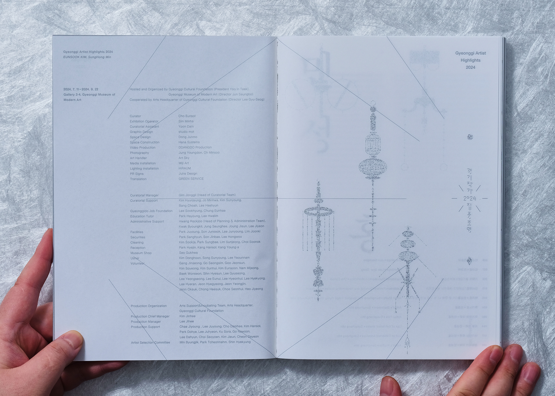
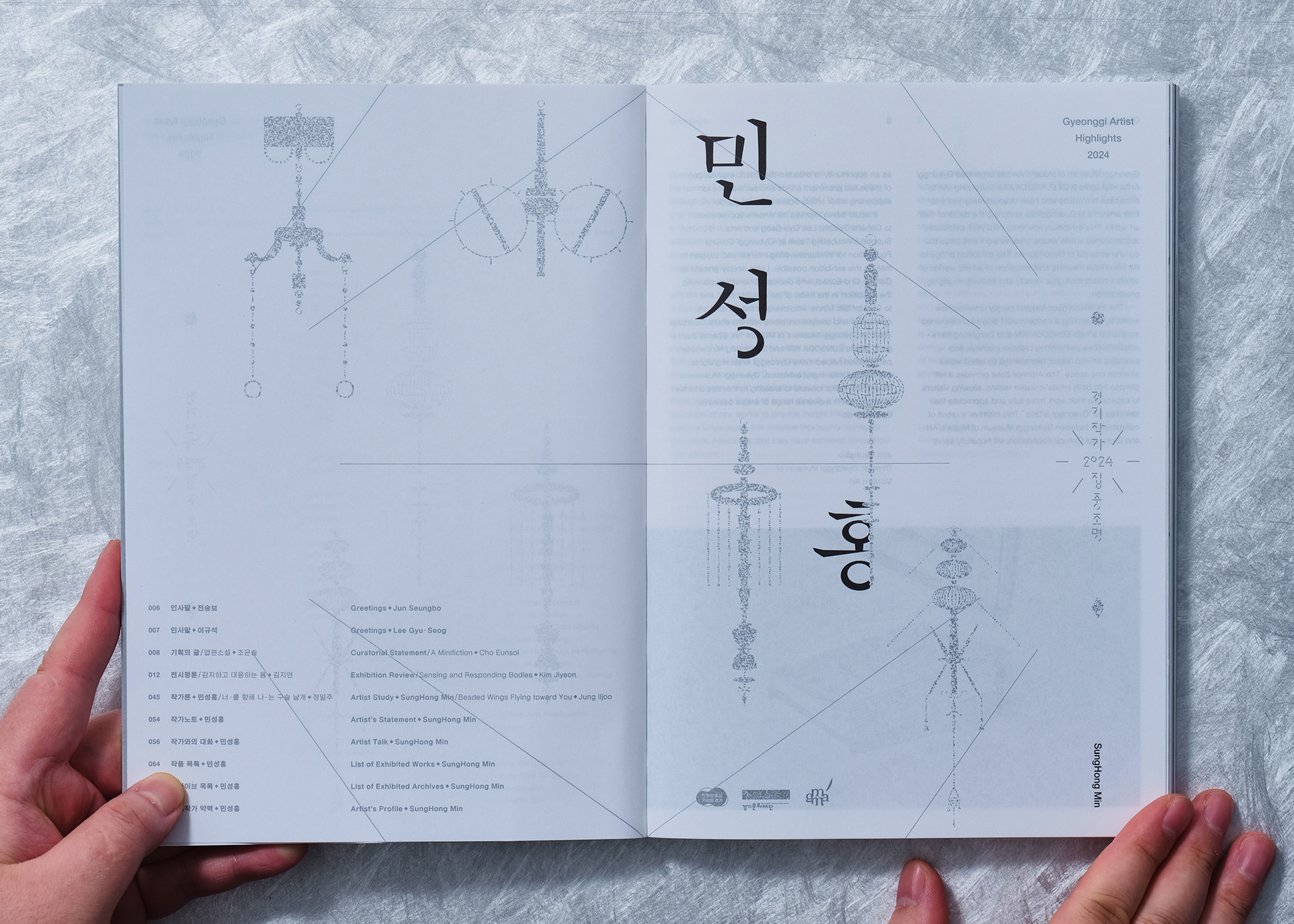
이번 도록은 두 명의 참여 작가를 한 권의 책 안에서 가장 독립적이고 동등한 비중으로 소개하기 위해 완벽한 좌우 대칭 구조로 기획되었습니다. 일반적인 책이 단방향으로 읽히는 것과 달리, 책의 앞뒤 표지 양쪽에 두 작가의 인트로를 각각 배치하여 양방향 모두가 책의 시작점이 되도록 설계했습니다.
독자가 양쪽에서부터 각각의 작가 파트를 읽어 들어가다가, 책의 정중앙 페이지에서 만나도록 동선을 구축했습니다. 한 작가의 파트가 끝나면 중간부터 페이지가 거꾸로 보이며, 이때 책을 뒤집어 반대편 작가의 파트를 동일한 방향으로 읽어 나갈 수 있습니다. 두 작가가 만나는 가운데 페이지에는 전시 아이덴티티 그래픽을 연출하여, 독립적인 두 파트를 하나로 묶어주는 시각적 통일성을 부여했습니다.
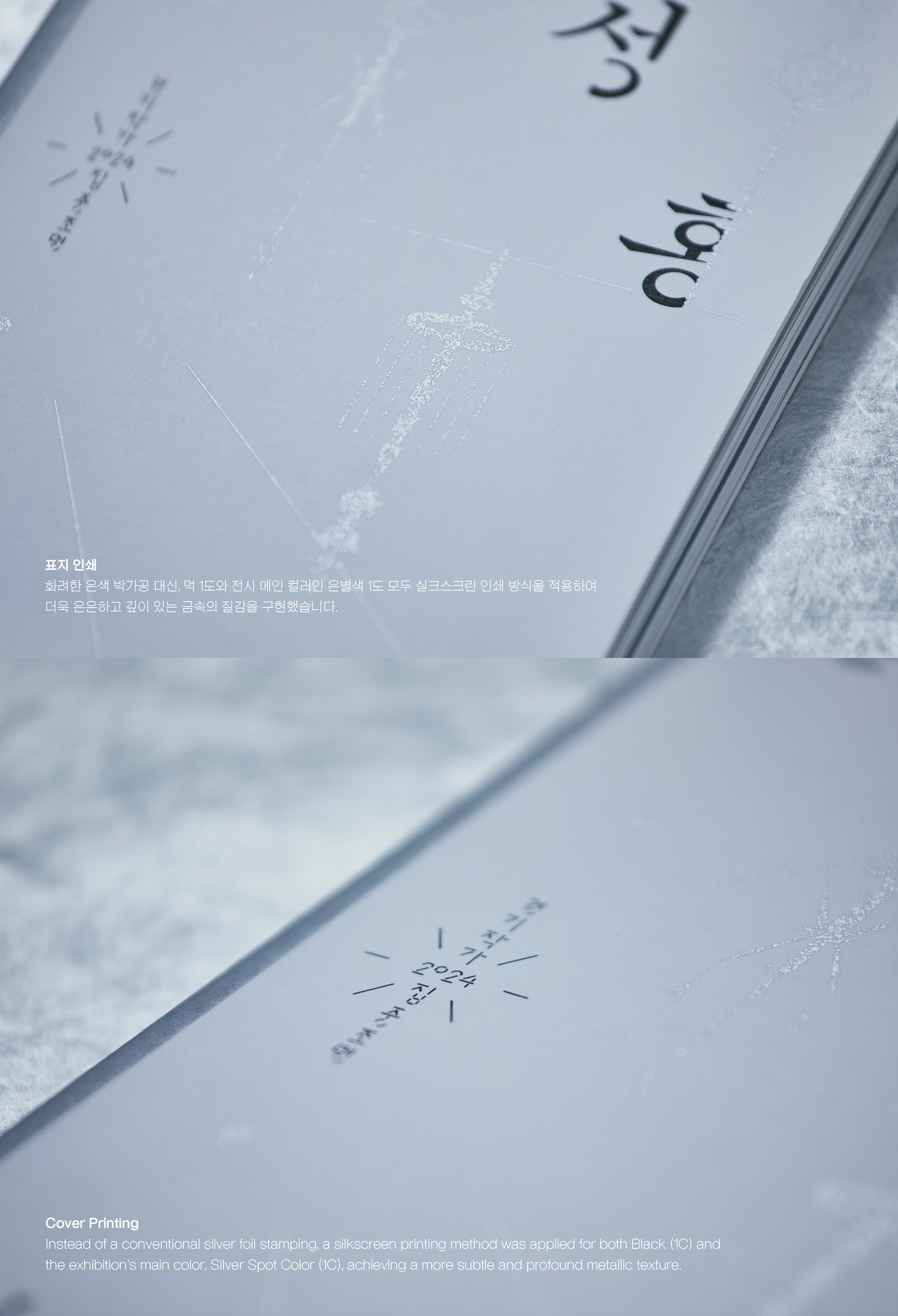
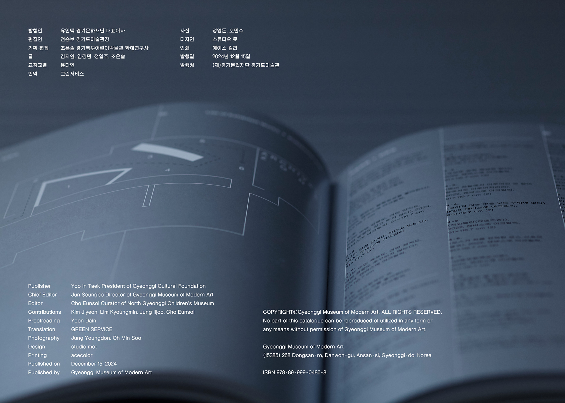
표지 인쇄
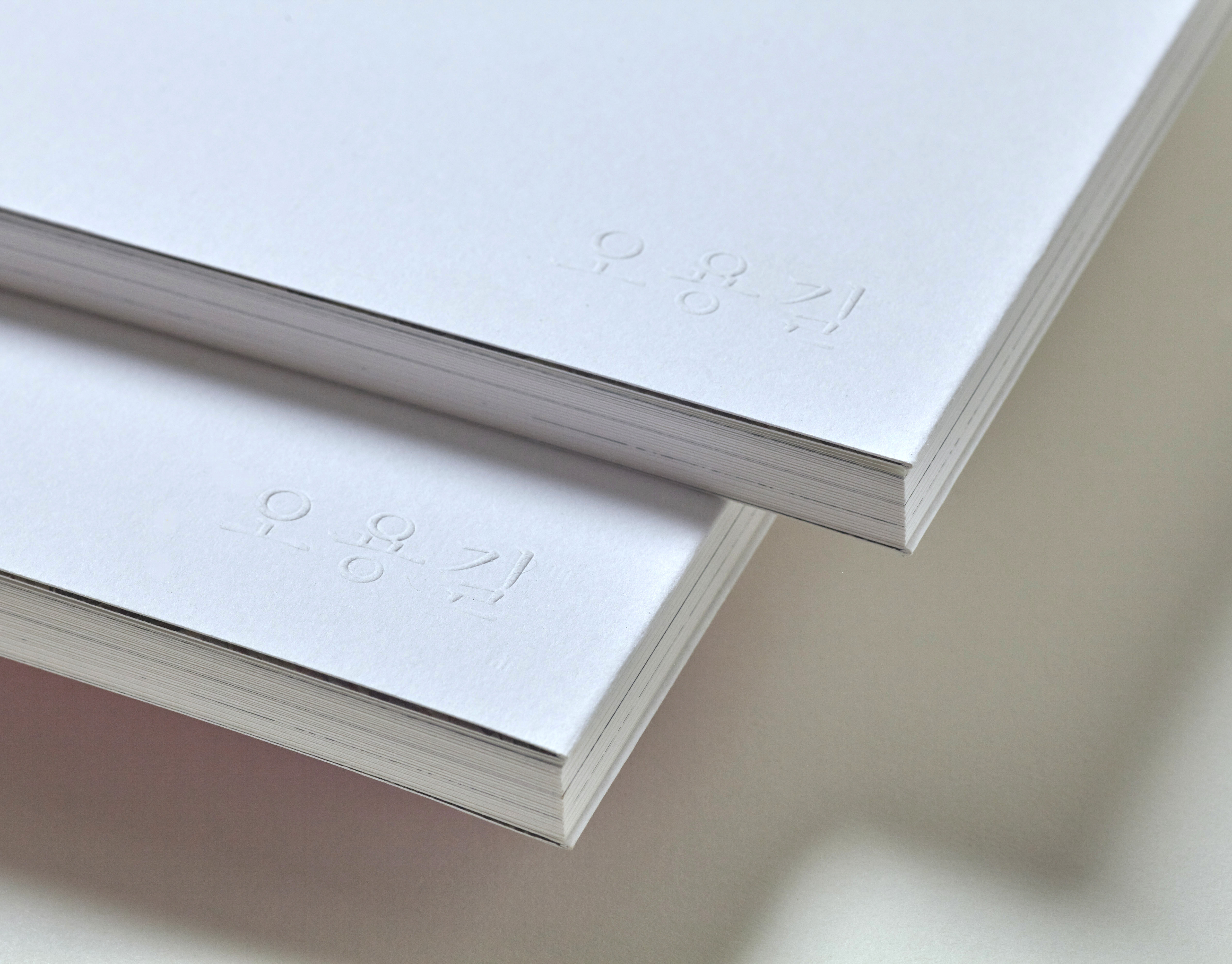
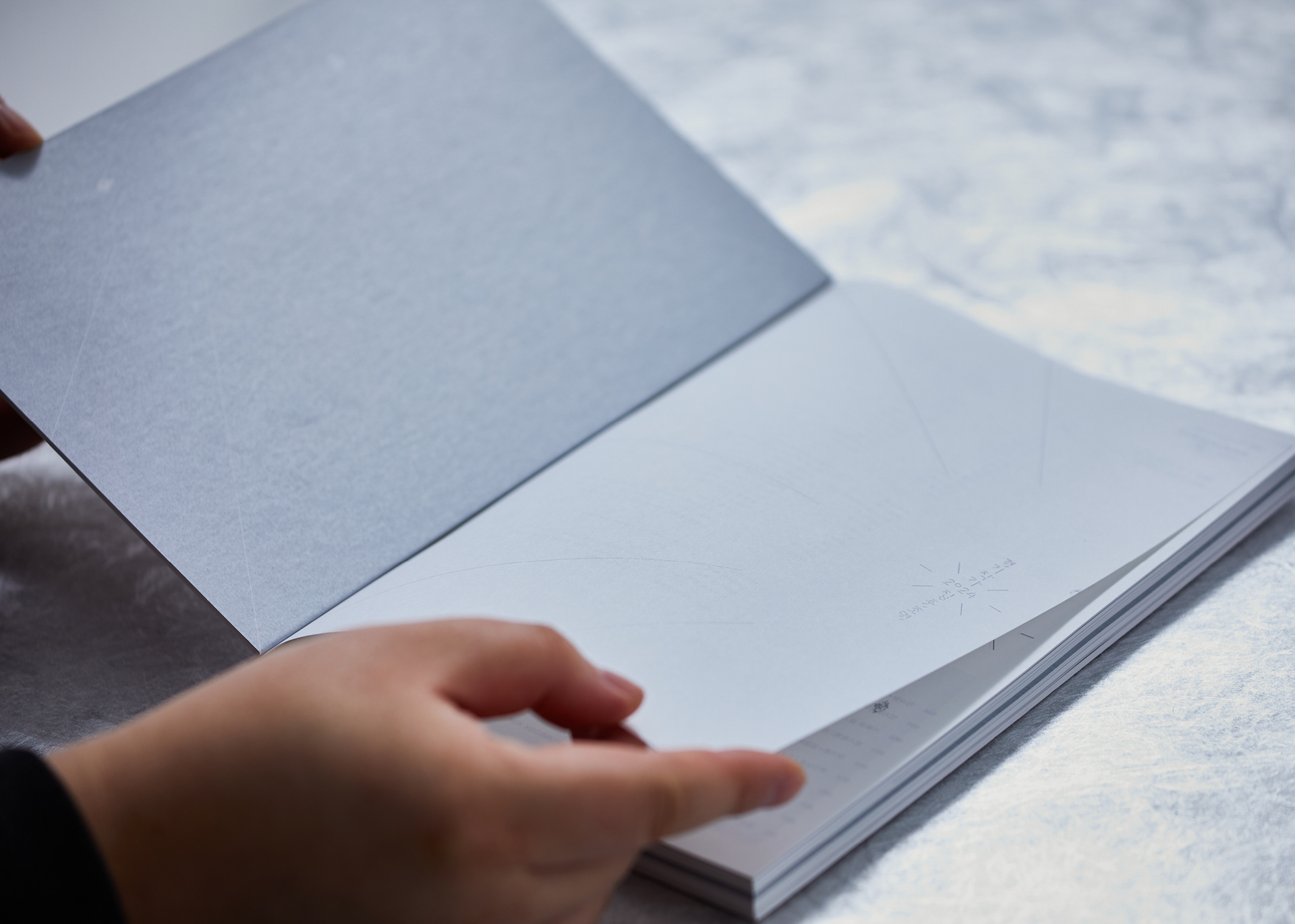
화려한 은색 박가공 대신, 먹 1도와 전시 메인 컬러인 은별색 1도 모두 실크스크린 인쇄 방식을 적용하여 더욱 은은하고 깊이 있는 금속의 질감을 구현했습니다.
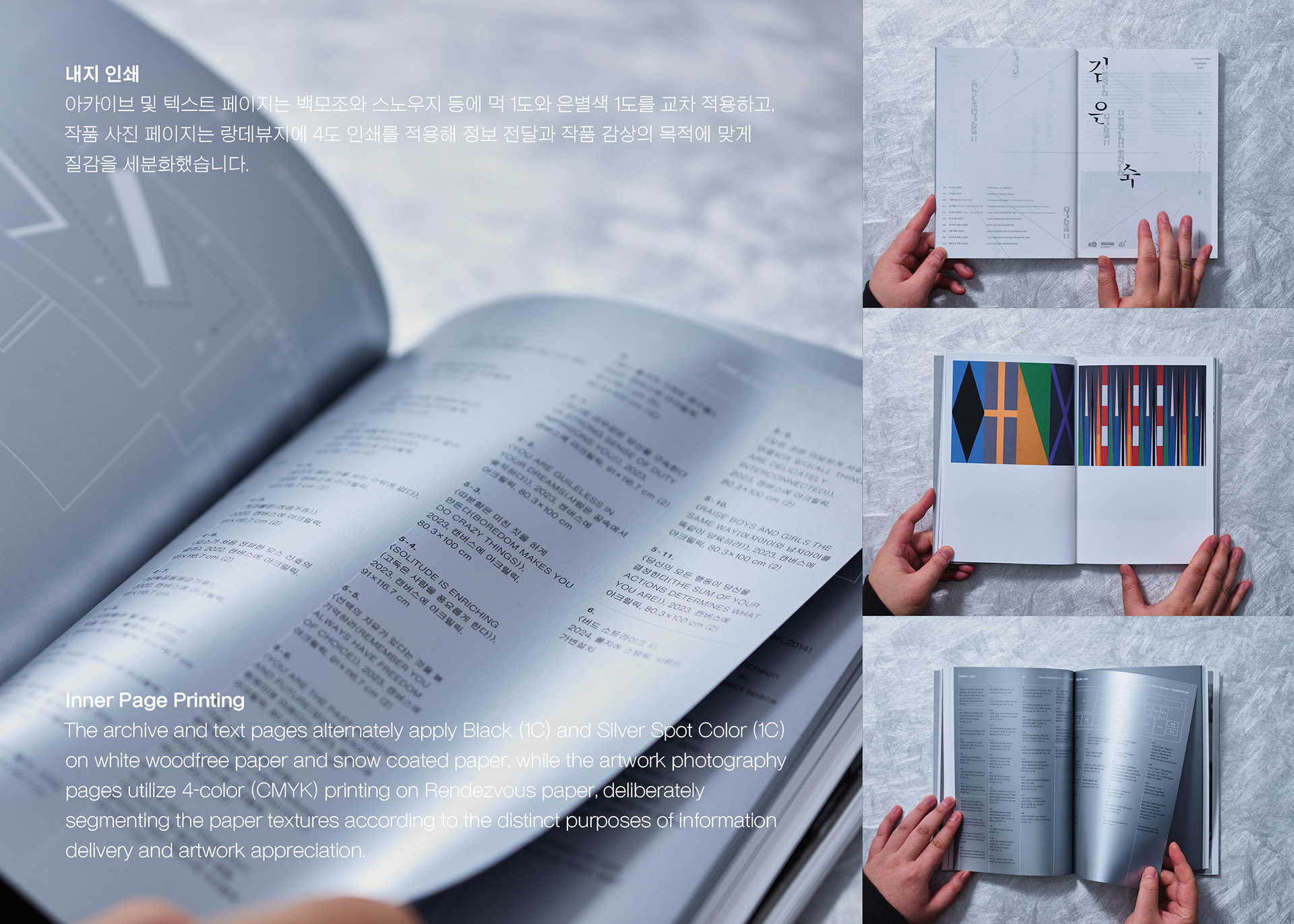
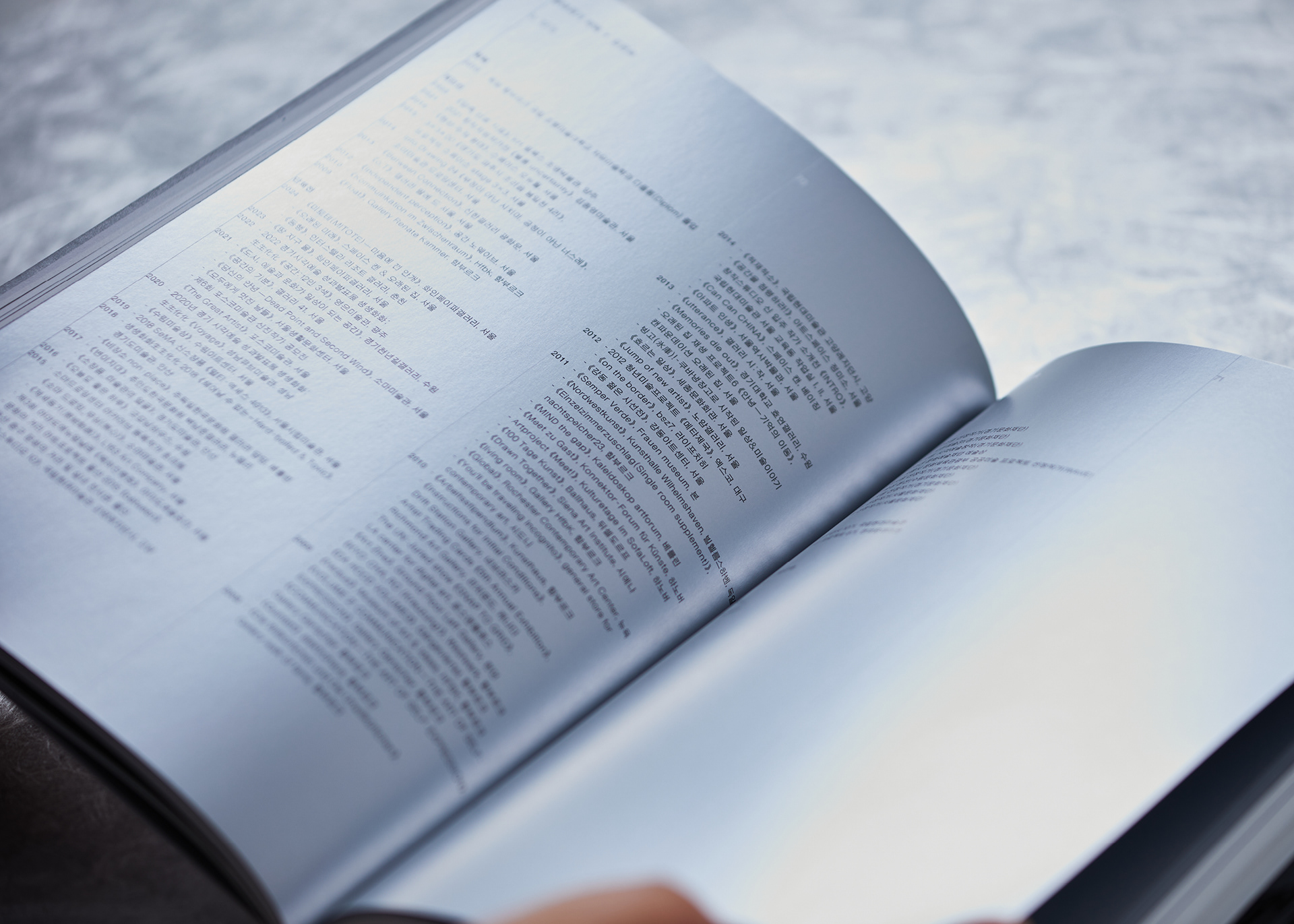
내지 인쇄 아카이브 및 텍스트 페이지는 백모조와 스노우지 등에 먹 1도와 은별색 1도를 교차 적용하고, 작품 사진 페이지는 랑데뷰지에 4도 인쇄를 적용해 정보 전달과 작품 감상의 목적에 맞게 질감을 세분화했습니다.
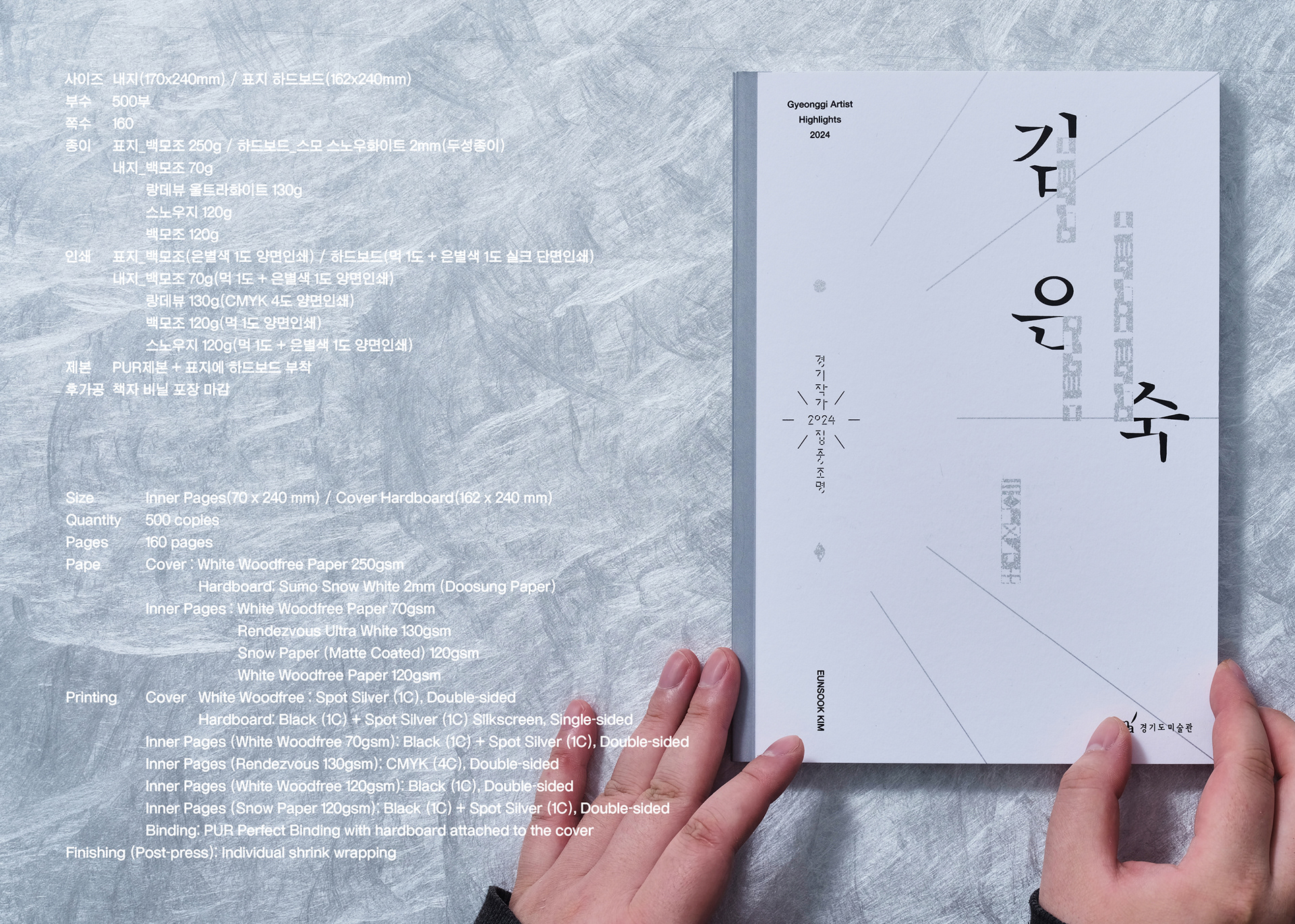
사이즈 : 내지(170x240mm) / 표지 하드보드(162x240mm)
부수 : 500부 쪽수 160
종이 : 표지_백모조 250g / 하드보드_스모 스노우화이트 2mm(두성종이) / 내지_백모조 70g / 랑데뷰 울트라화이트 130g / 스노우지 120g / 백모조 120g
인쇄 : 표지_백모조(은별색 1도 양면인쇄) / 하드보드(먹 1도 + 은별색 1도 실크 단면인쇄) / 내지_백모조 70g(먹 1도 + 은별색 1도 양면인쇄) / 랑데뷰 130g(CMYK 4도 양면인쇄) / 백모조 120g(먹 1도 양면인쇄) / 스노우지 120g(먹 1도 + 은별색 1도 양면인쇄)
제본 : PUR제본 + 표지에 하드보드 부착
후가공 : 책자 비닐 포장 마감
Design Structure: Symmetrical Bi-directional Layout
This catalog was planned with a perfectly symmetrical structure to introduce the two participating artists with equal weight and independence within a single volume. Unlike a typical book read in a single direction, introductory sections for both artists were placed on the front and back covers, establishing both ends as starting points for the book.
The reading flow was designed so that the reader progresses through each artist’s section from opposite ends and meets at the exact center pages of the book. When one artist’s section concludes, the subsequent pages appear upside down; at this point, the book can be flipped over to read the other artist’s section in the corresponding direction. The exhibition identity graphic was placed on the center spread where the two artists meet, providing a visual unity that binds the two independent sections together.
Cover Printing
Instead of a conventional silver foil stamping, a silkscreen printing method was applied for both Black (1C) and the exhibition’s main color, Silver Spot Color (1C), achieving a more subtle and profound metallic texture.
Inner Page Printing
The archive and text pages alternately apply Black (1C) and Silver Spot Color (1C) on white woodfree paper and snow coated paper, while the artwork photography pages utilize 4-color (CMYK) printing on Rendezvous paper, deliberately segmenting the paper textures according to the distinct purposes of information delivery and artwork appreciation.
Size : Inner Pages(70 x 240 mm) / Cover Hardboard(162 x 240 mm)
Quantity : 500 copies
Pages : 160 pages
Pape : Cover : White Woodfree Paper 250gsm / Hardboard: Sumo Snow White 2mm (Doosung Paper)
Inner Pages : White Woodfree Paper 70gsm / Rendezvous Ultra White 130gsm / Snow Paper (Matte Coated) 120gsm / White Woodfree Paper 120gsm
Printing : Cover_White Woodfree : Spot Silver (1C), Double-sided / Hardboard: Black (1C) + Spot Silver (1C) Silkscreen, Single-sided
Inner Pages (White Woodfree 70gsm): Black (1C) + Spot Silver (1C), Double-sided / Inner Pages (Rendezvous 130gsm): CMYK (4C), Double-sided / Inner Pages (White Woodfree 120gsm): Black (1C), Double-sided / Inner Pages (Snow Paper 120gsm): Black (1C) + Spot Silver (1C), Double-sided
Binding: PUR Perfect Binding with hardboard attached to the cover
Finishing (Post-press): Individual shrink wrapping