
2024 안양연고작가지원전 아이덴티티
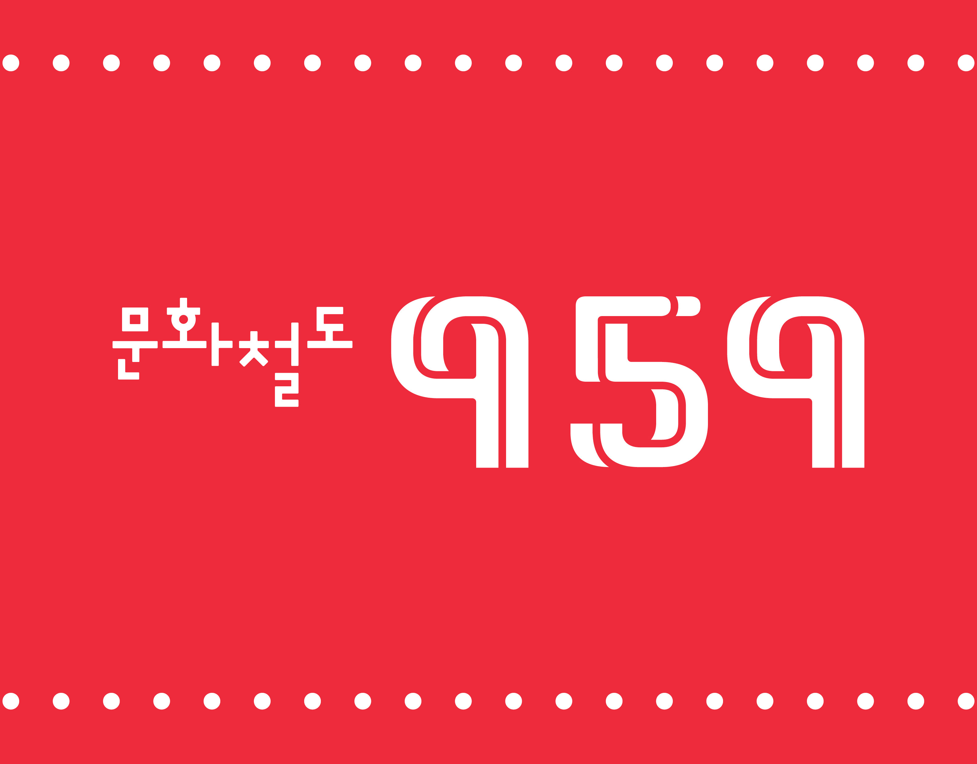
2014년 시작된 안양연고작가지원전은 지난 10년간 이어졌지만, 일관된 아이덴티티가 부재한 상태였다. 10년이 넘는 시점에서 공통된 이미지 구축의 필요성이 제기되었고, 상징뿐 아니라 시스템과 매뉴얼이 필요했으나 기반은 충분하지 않았다. 그럼에도 완전한 체계 구축이 어려운 상황에서, 최소한의 시도로서 상징적 요소를 먼저 마련해 아이덴티티의 방향성을 제시하고자 했다.
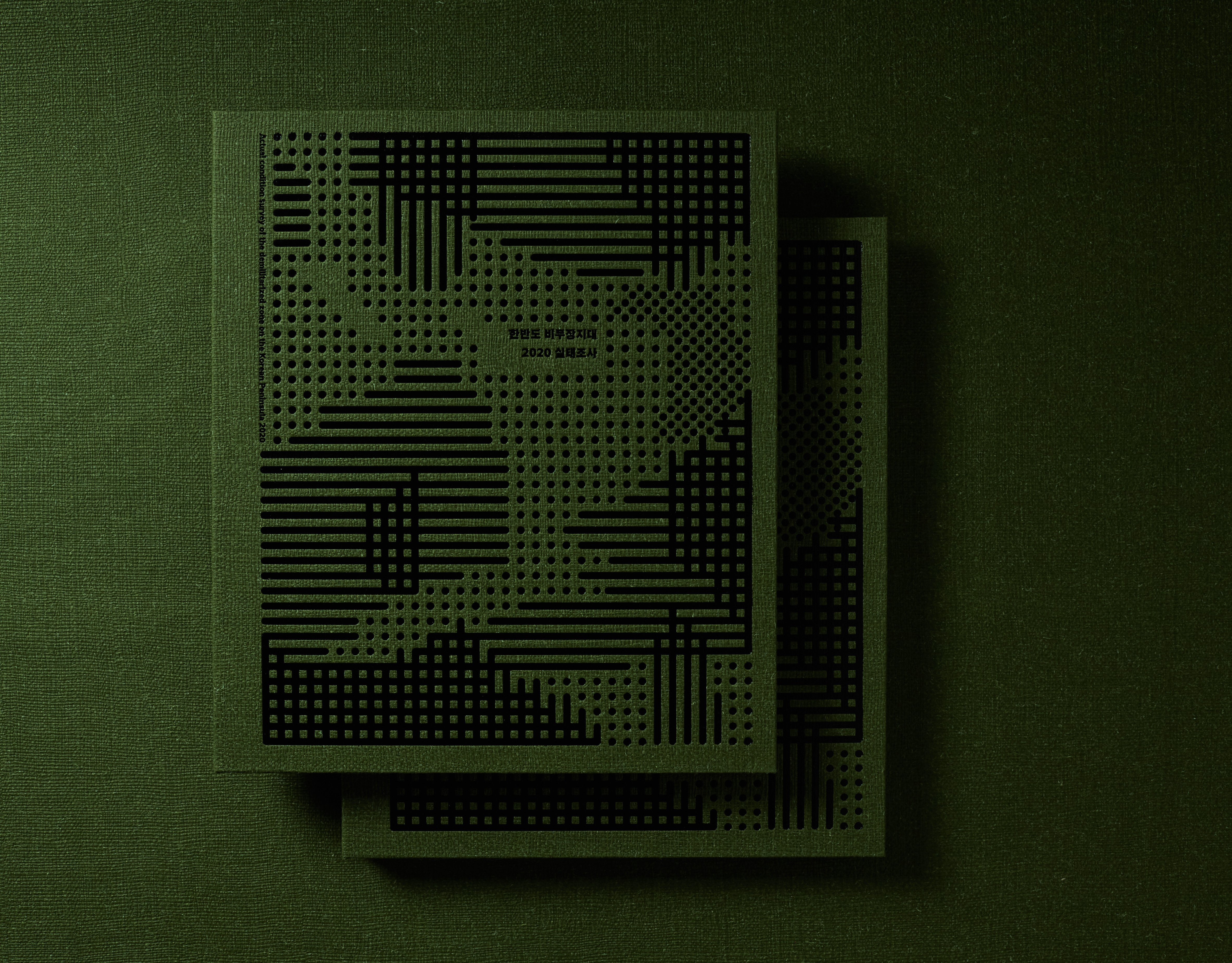
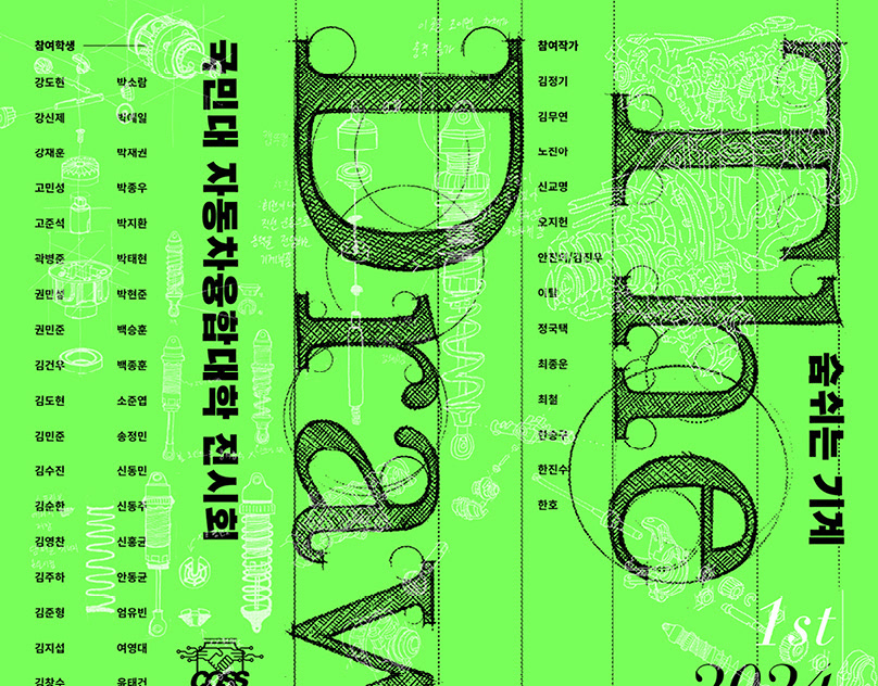
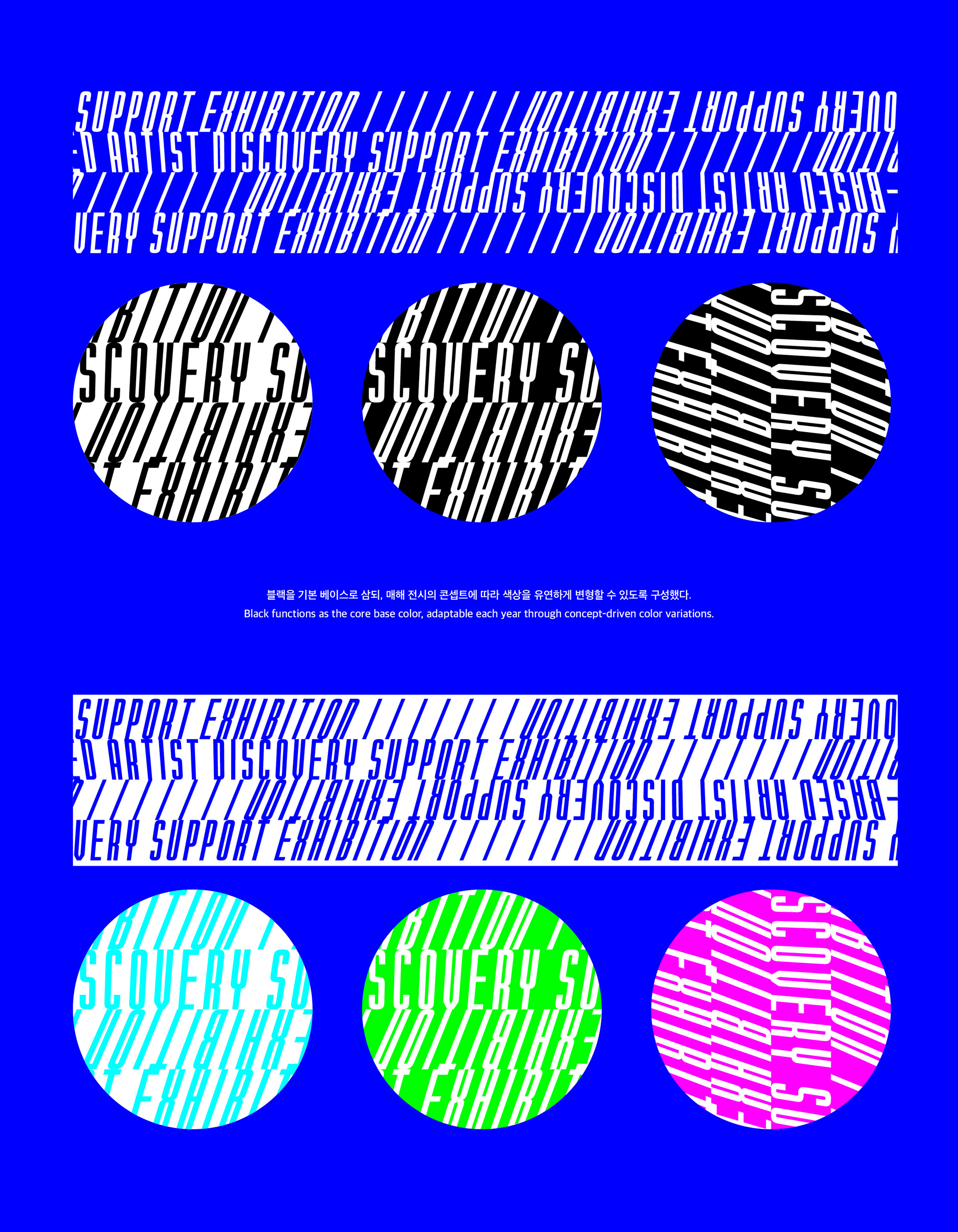
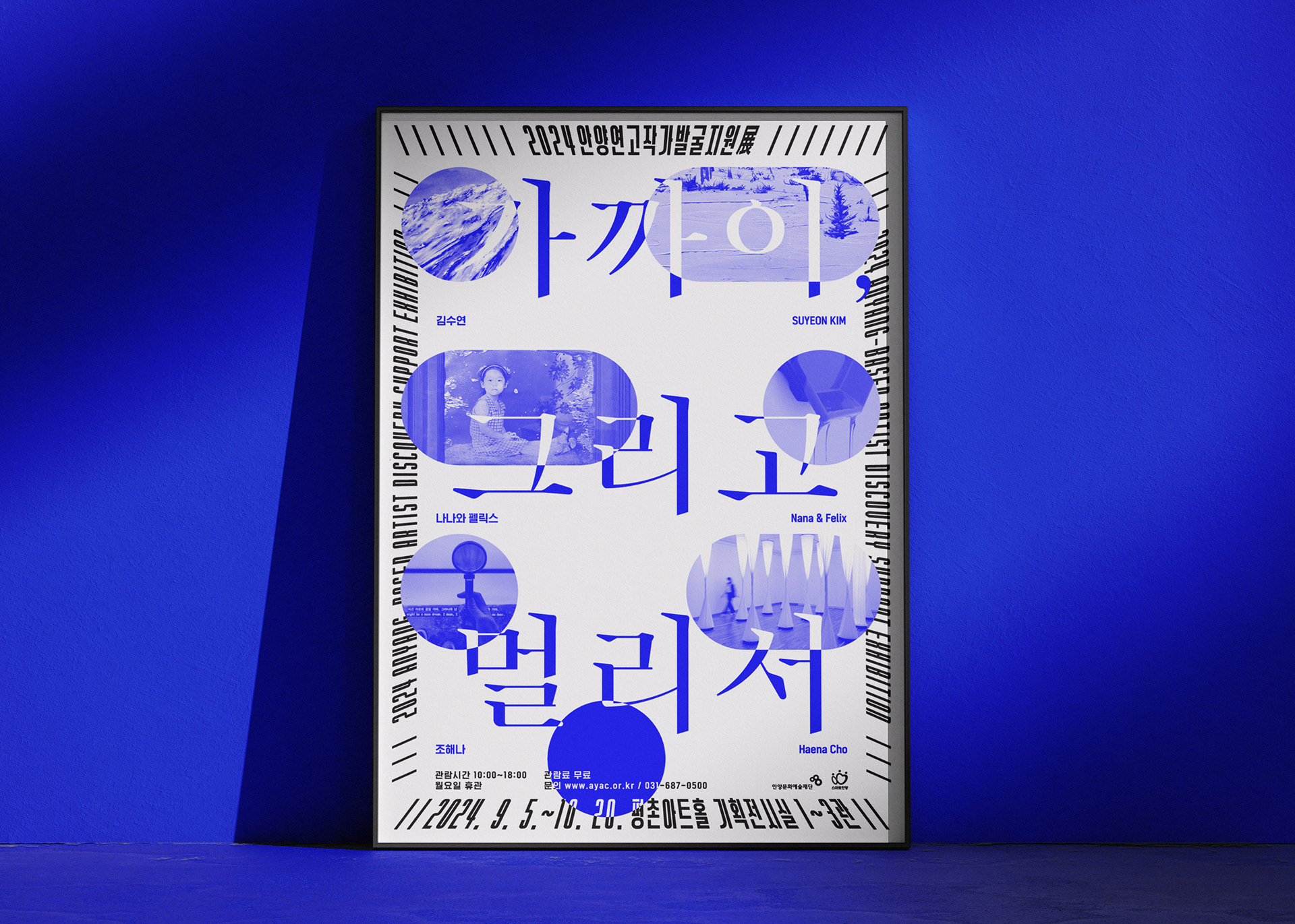
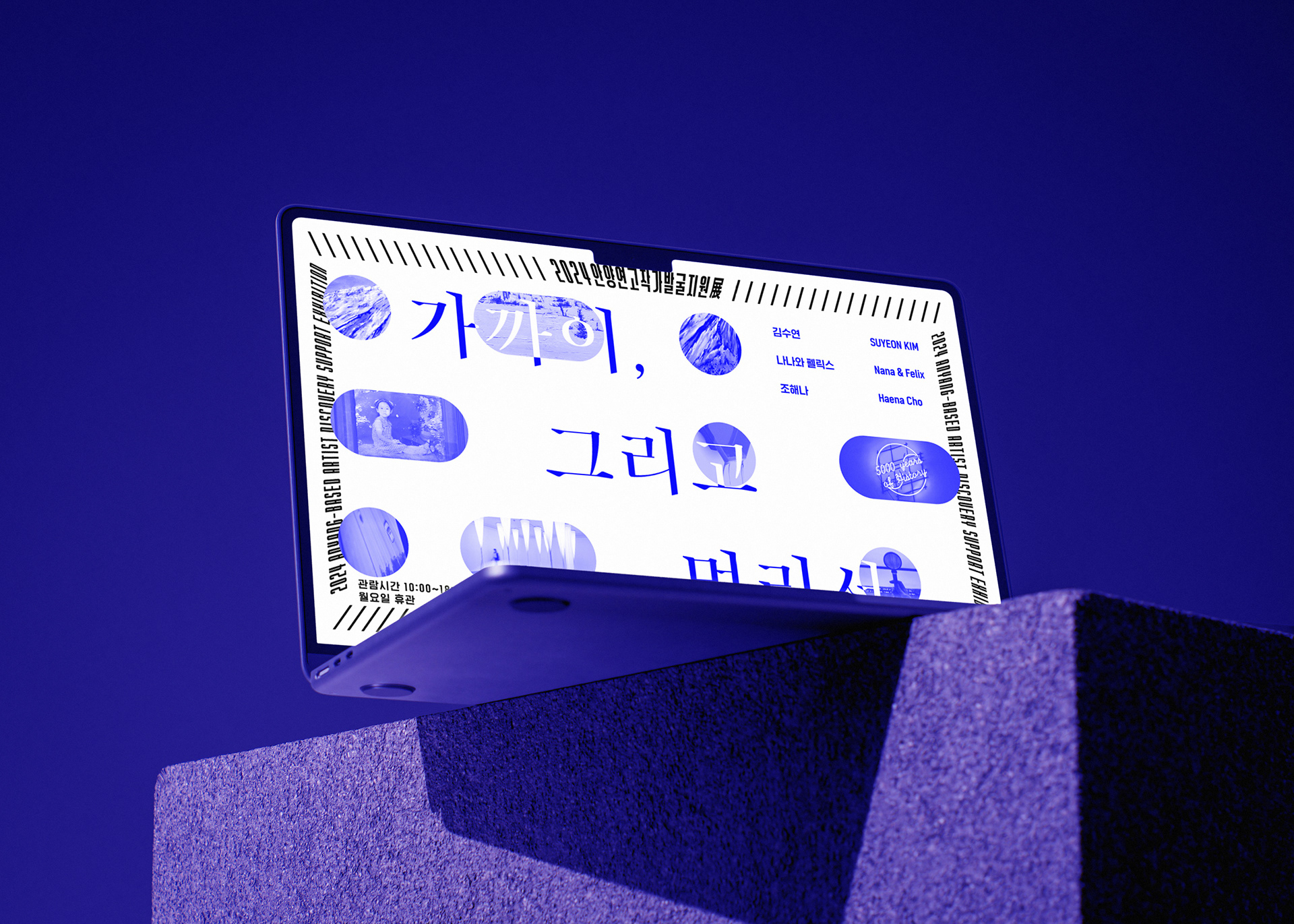
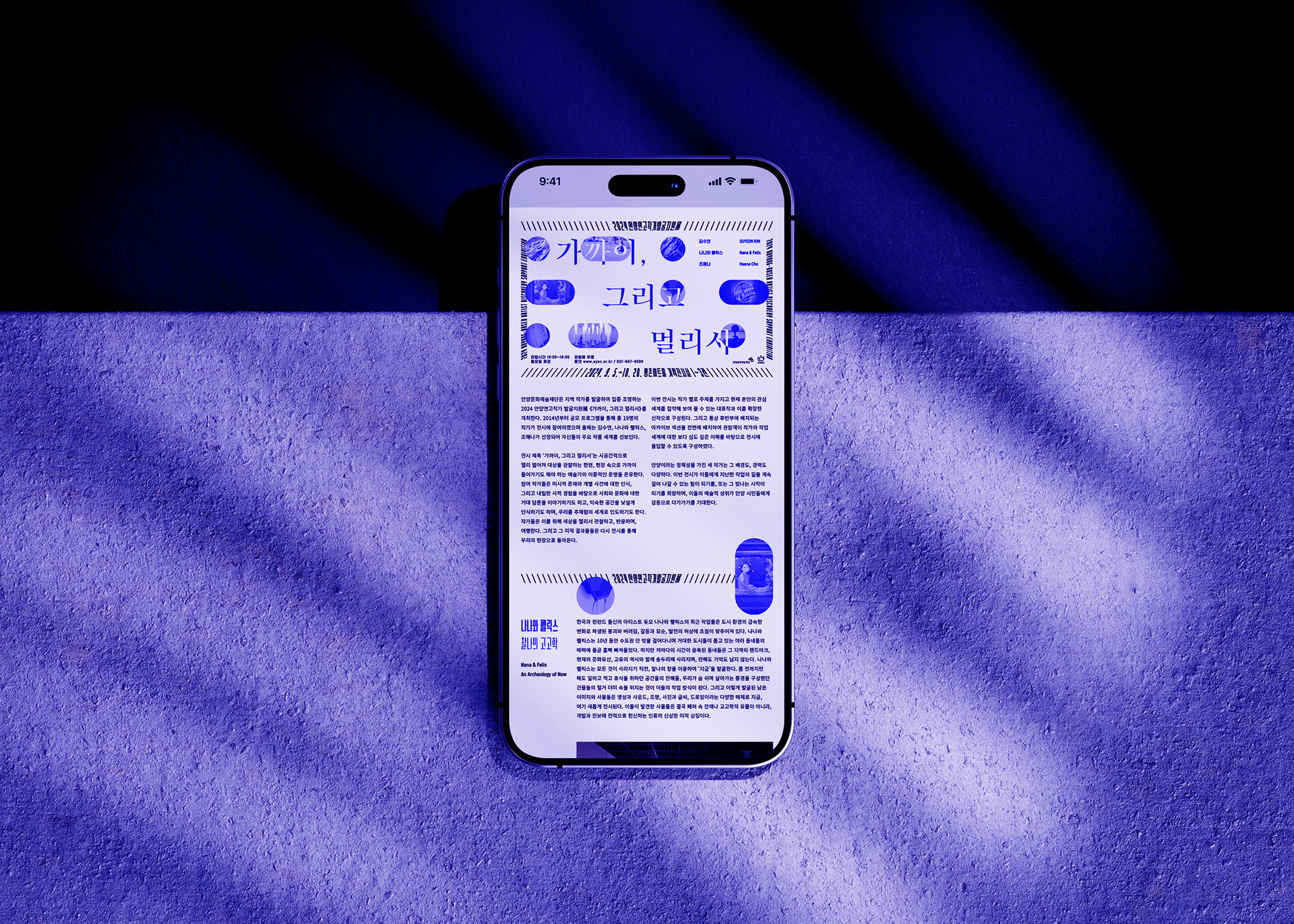
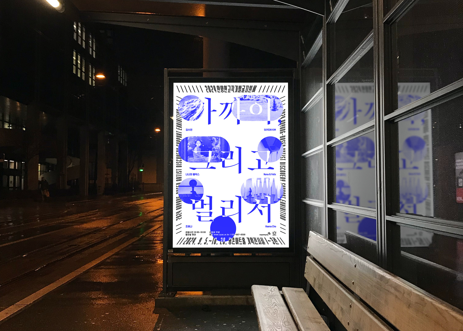
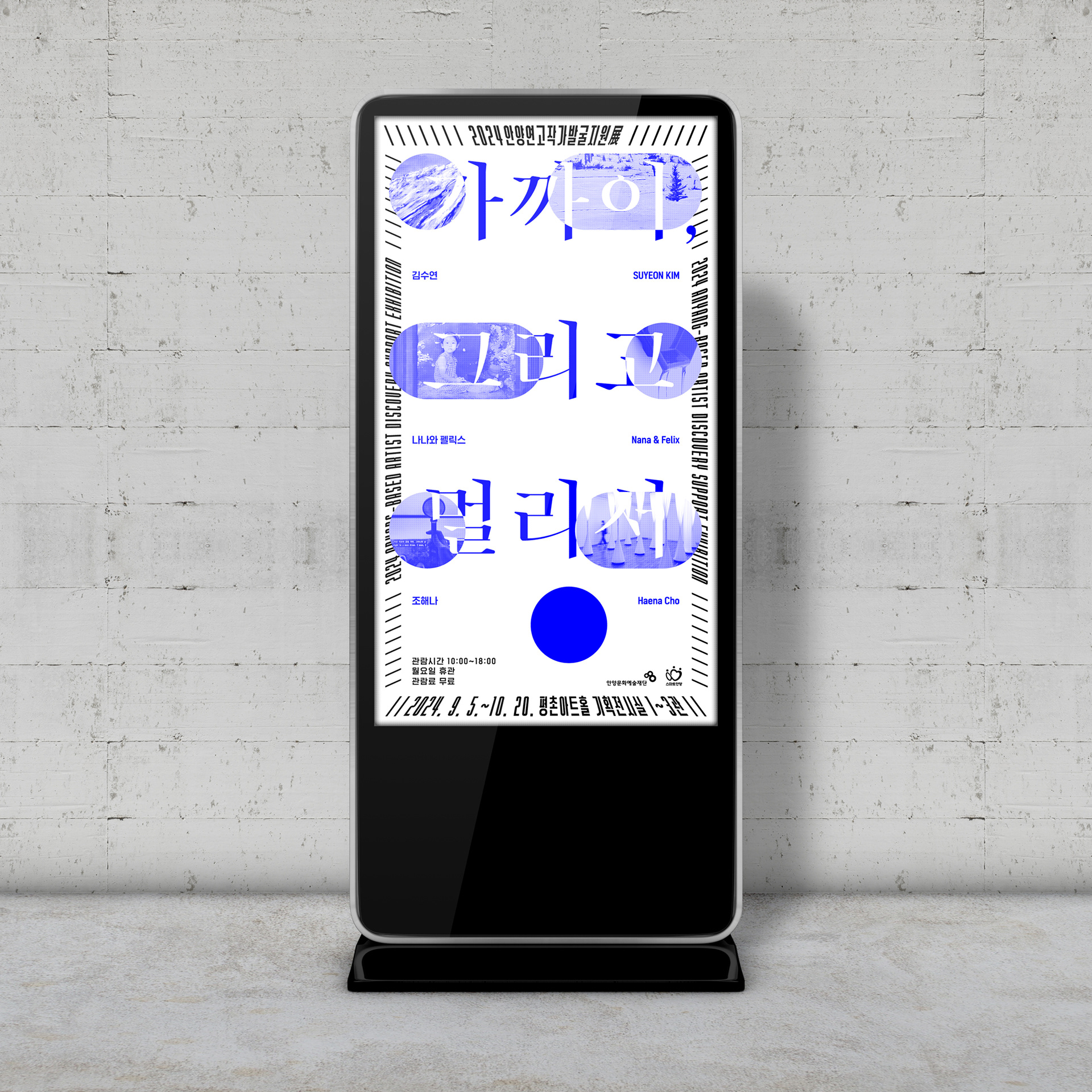
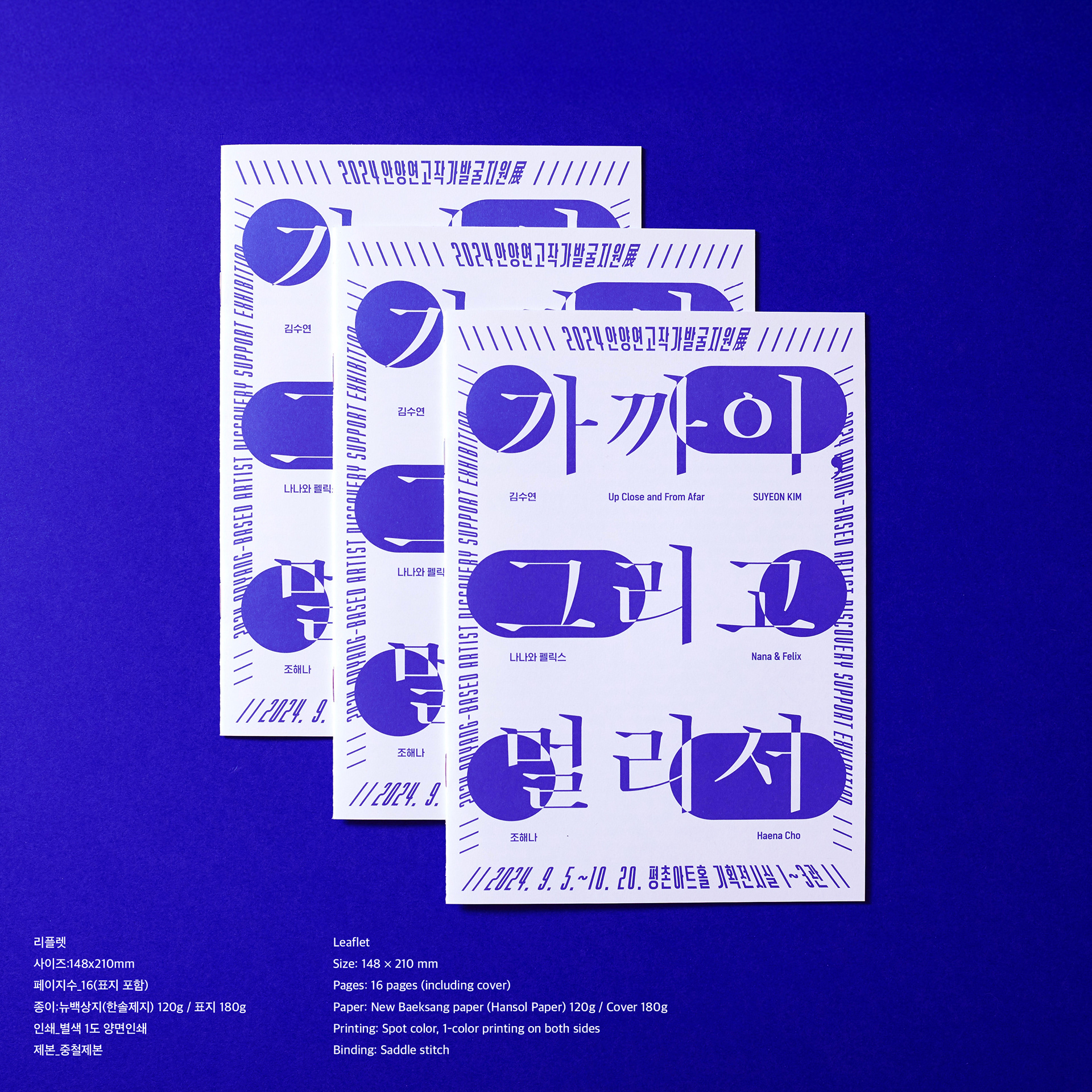
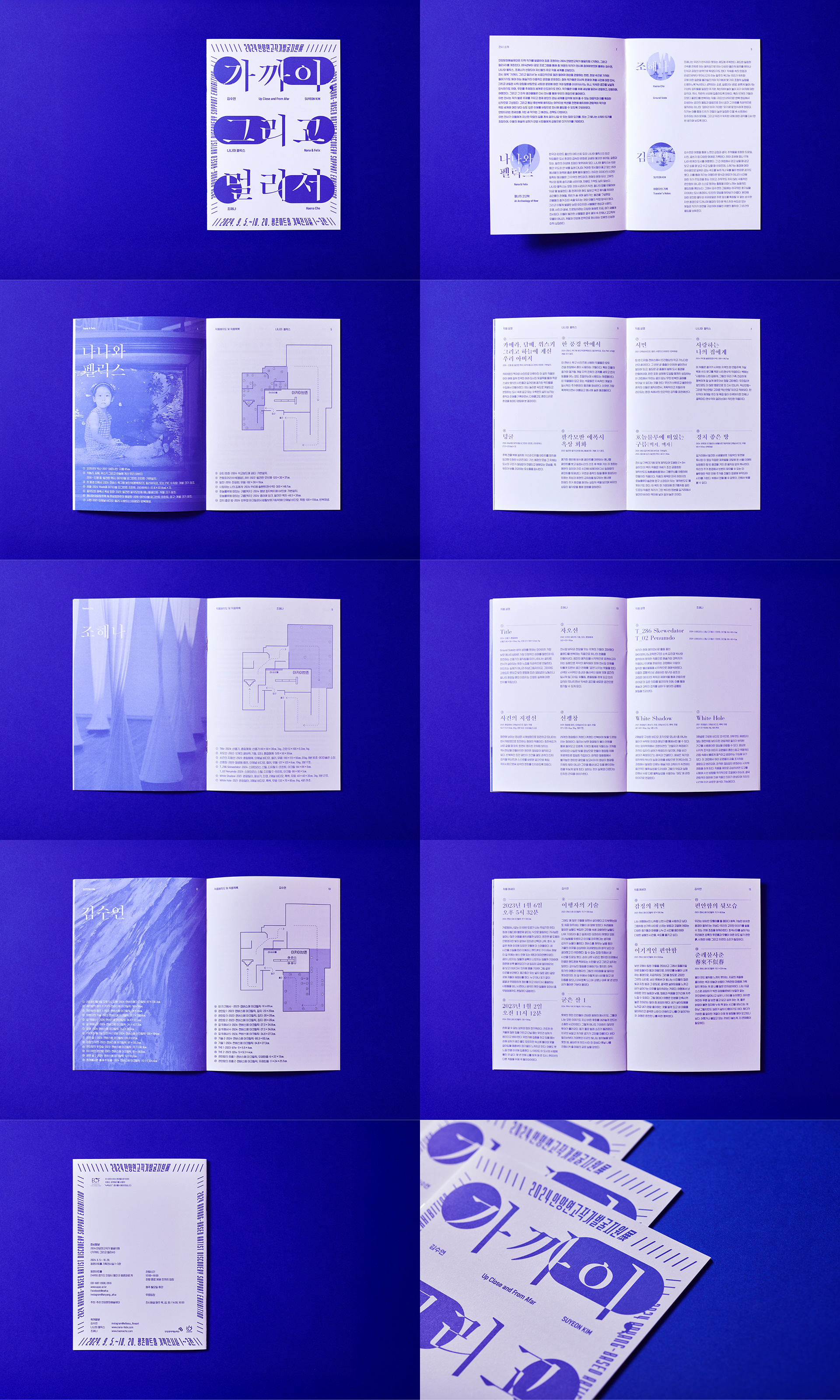
안양연고작가지원전의 타이틀은 본래 길고, 연도가 더해지면 더욱 길어진다. 일반적으로는 영문 스펠링을 압축해 아이덴티티를 만들지만, 이번에는 그 방식을 적용하기 어려웠다. 사업은 작가 지원에 초점을 두면서도 관람자를 위한 설명적 성격을 갖기 때문에, 타이틀 자체가 ‘안양 연고 작가를 지원하는 전시’라는 의미를 지나치게 친절하게 전달하고 있다. 이런 제목을 상징적으로만 축약하는 것은 사업의 방향성과 맞지 않다고 판단했다. 그래서 타이틀을 가능한 한 유지한 채, 매년 달라지는 전시 콘셉트를 담아낼 수 있는 이미지 시스템을 만드는 방향을 고려했다.
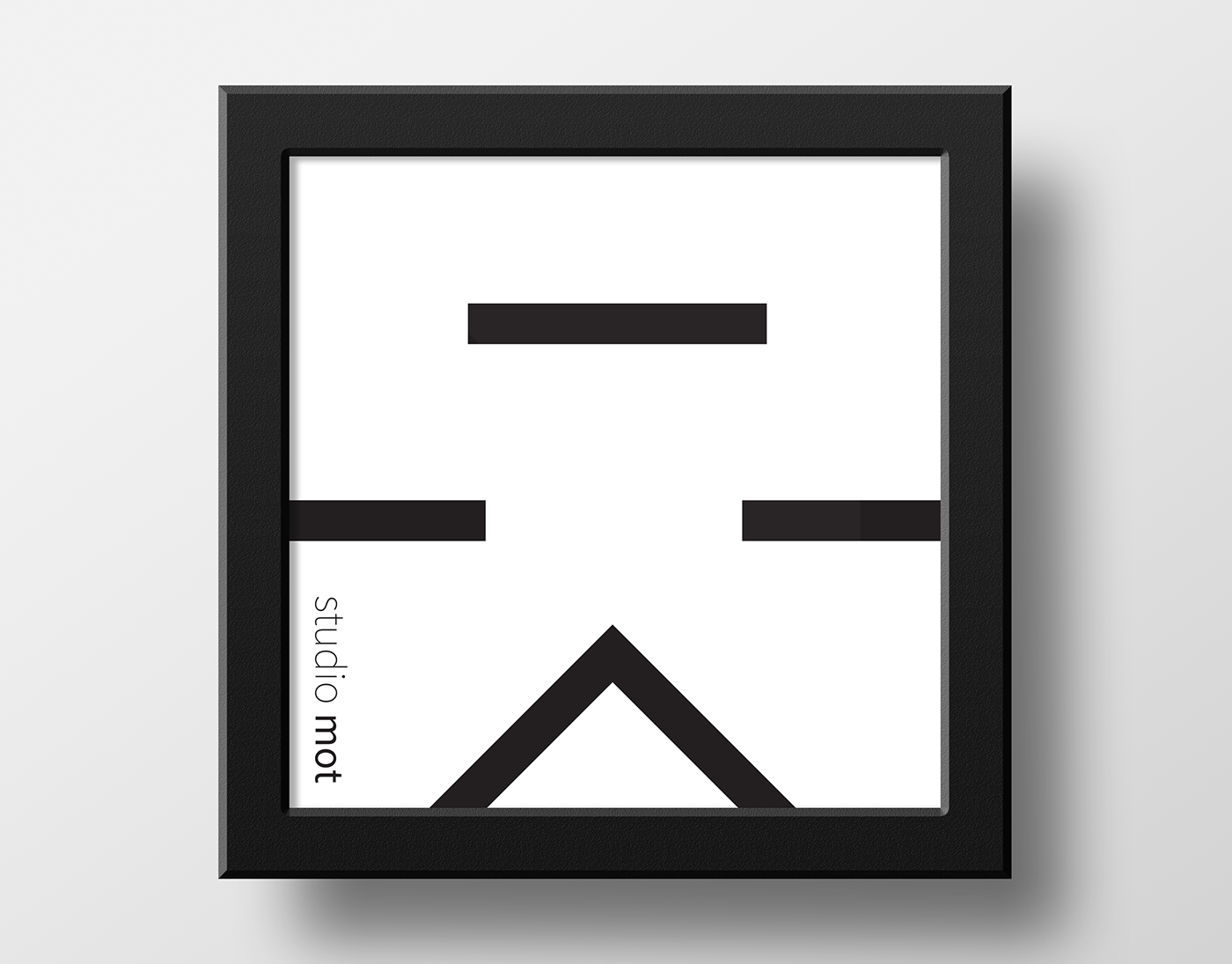
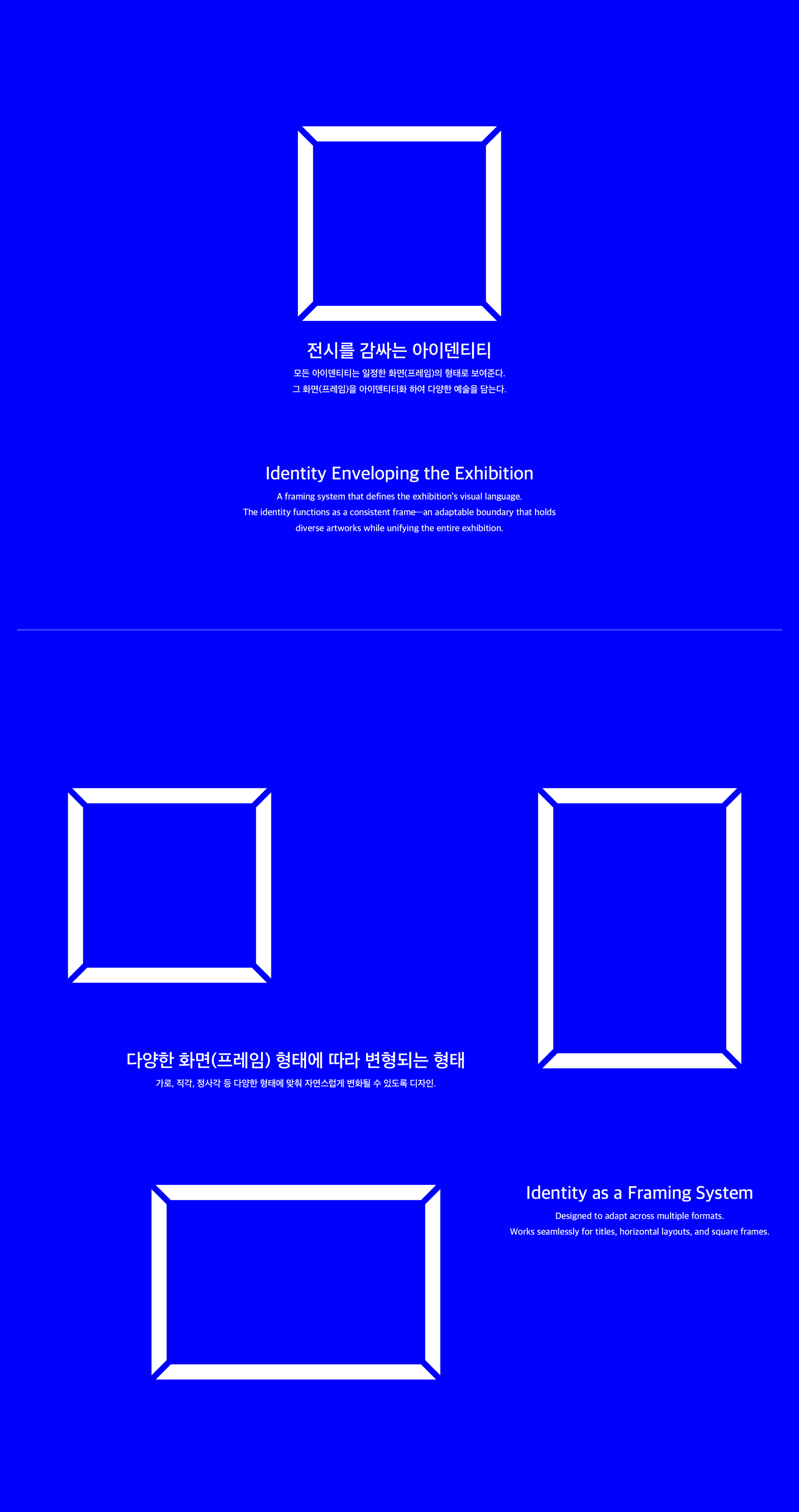
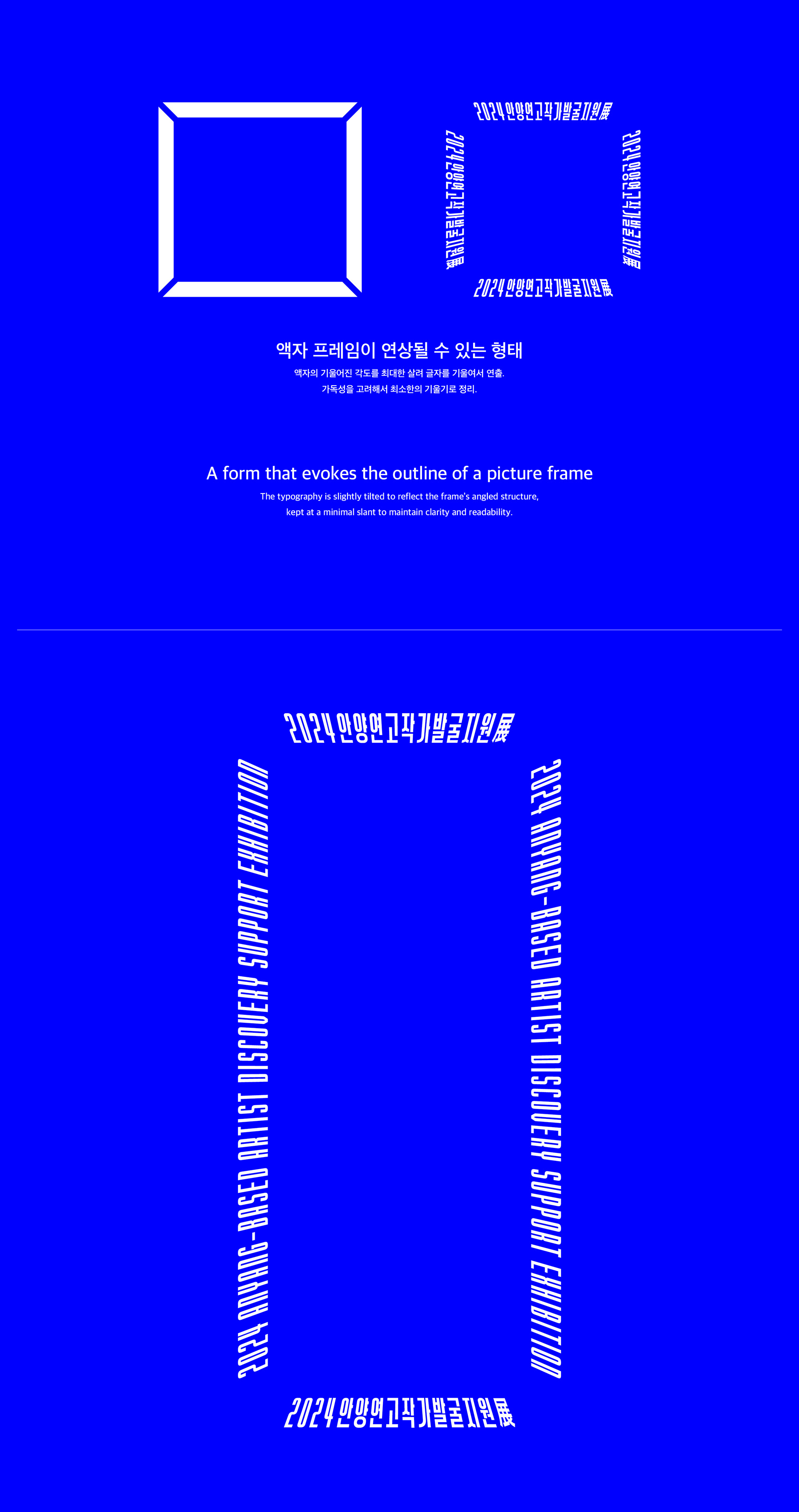
액자는 작품을 담는 그릇인 동시에 간접적으로 작품의 상징성을 보조해주는 역할을 한다. 그러면서도 작품의 이미지를 손상시키지 않으면서 작품을 보호해준다. 긴타이틀의 특성을 오히려 활용하여 라인적인 형태로 확장하여 하나의 액자적인 역할을 할 수 있도록 했다. 타이틀은 국문과 영문이 있기에. 상대적으로 짧은 국문타이틀을 가로중앙으로 오게 하여 주목도와 가독성을 높였다. 영문은 세로에 들어가게 하여 가독성보다는 액자의 장식같은 형태를 유도했다.
The Anyang-Based Artist Discovery Support Exhibition, which began in 2014, has continued for the past decade but lacked a consistent identity. Now, more than ten years later, the need to establish a unified image has been raised. Although symbolic elements, as well as a system and manual, were needed, the foundation was not sufficient. Even so, in a situation where developing a fully structured system was difficult, we aimed to present a direction for the identity by first establishing symbolic elements as a minimal initial step.
The title of the Anyang-Based Artist Discovery Support Exhibition is inherently long, and it becomes even longer when the year is added. Typically, English spellings are condensed to create an identity, but this approach was difficult to apply here. The project focuses on supporting artists while also serving an explanatory role for visitors, meaning that the title itself conveys its purpose—an exhibition supporting Anyang-based artists—in an overly explicit manner. We determined that reducing this title into a purely symbolic abbreviation would not align with the project’s intent. Therefore, we considered a visual system that maintains the full title as much as possible while allowing room for each year’s changing exhibition concept.
A frame serves both as a vessel that holds an artwork and as a structure that subtly enhances the work’s symbolic presence, all while protecting it without compromising its visual integrity. By embracing the long nature of the title, we extended it into a linear form so that it could function like a frame itself. Since the title exists in both Korean and English, the relatively short Korean title was placed horizontally at the center to improve visibility and readability. The English title was positioned vertically, prioritizing a decorative, frame-like quality over readability.