
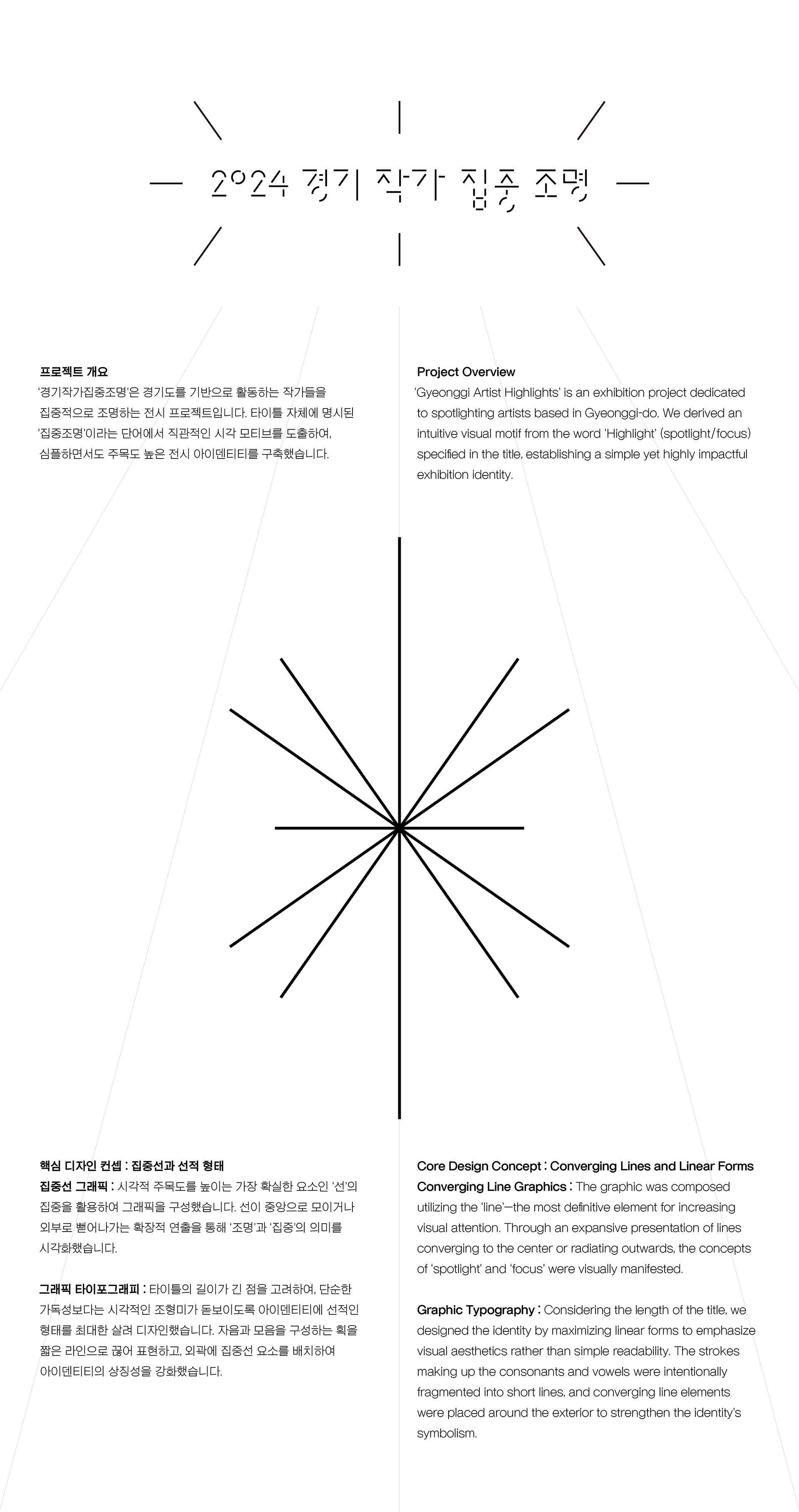

Project Overview
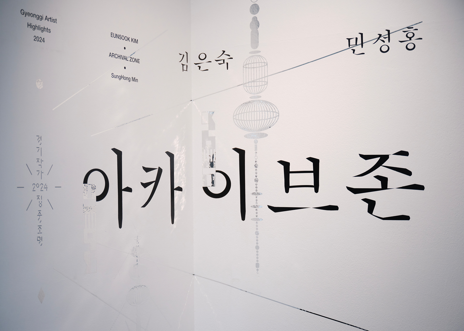
‘Gyeonggi Artist Highlights’ is an exhibition project dedicated to spotlighting artists based in Gyeonggi-do. We derived an intuitive visual motif from the word ‘Highlight’ (spotlight/focus) specified in the title, establishing a simple yet highly impactful exhibition identity.
Core Design Concept : Converging Lines and Linear Forms
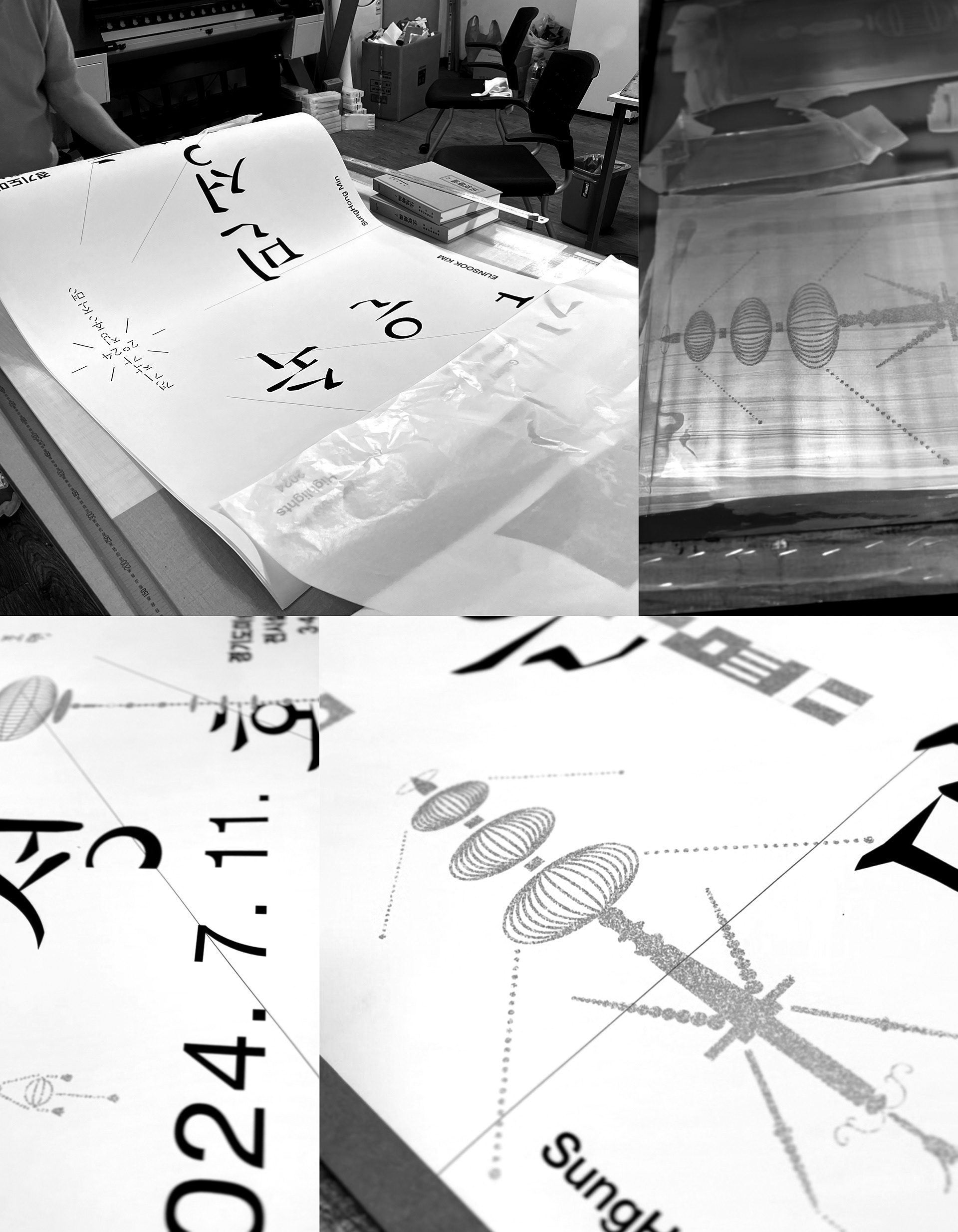
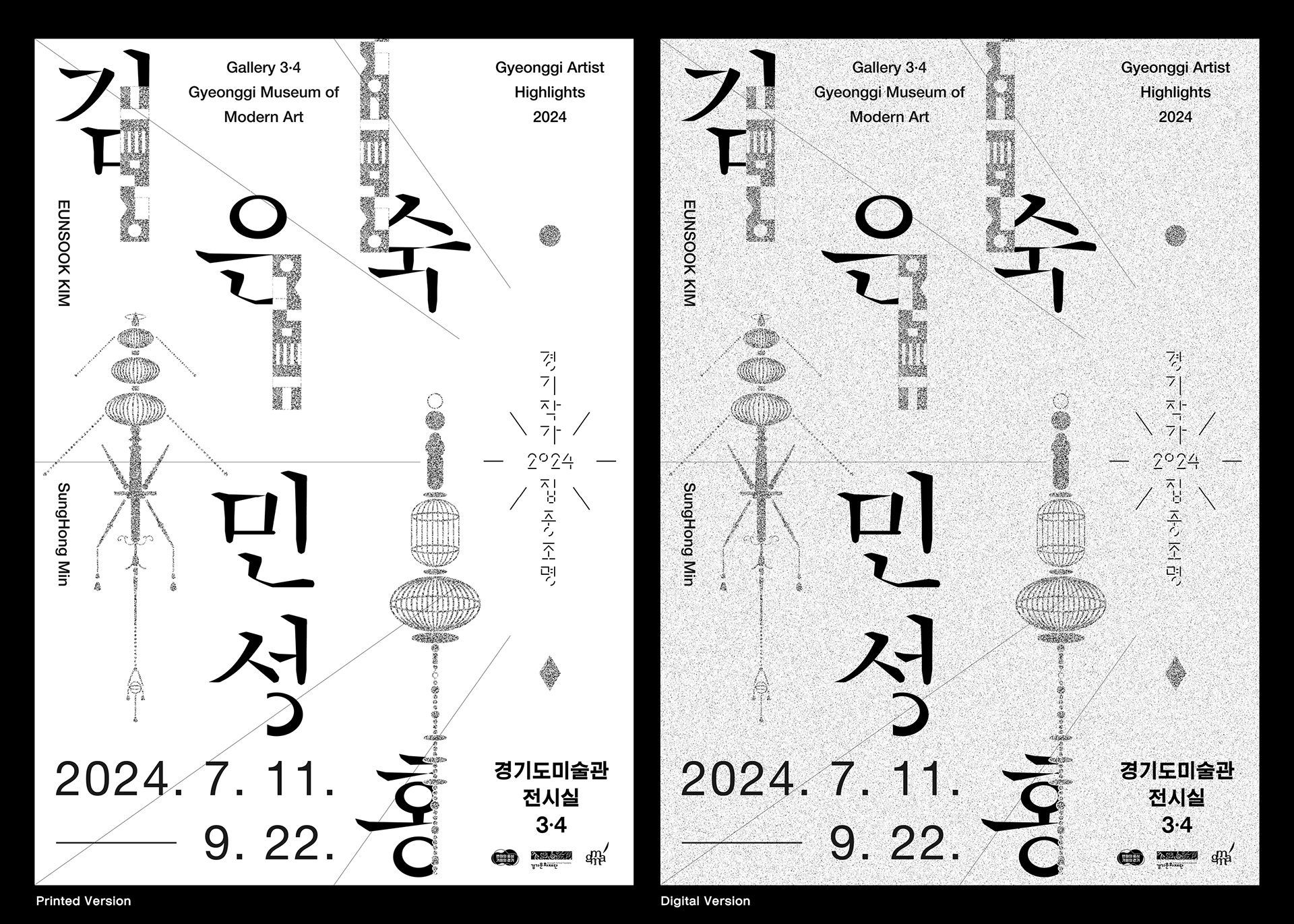
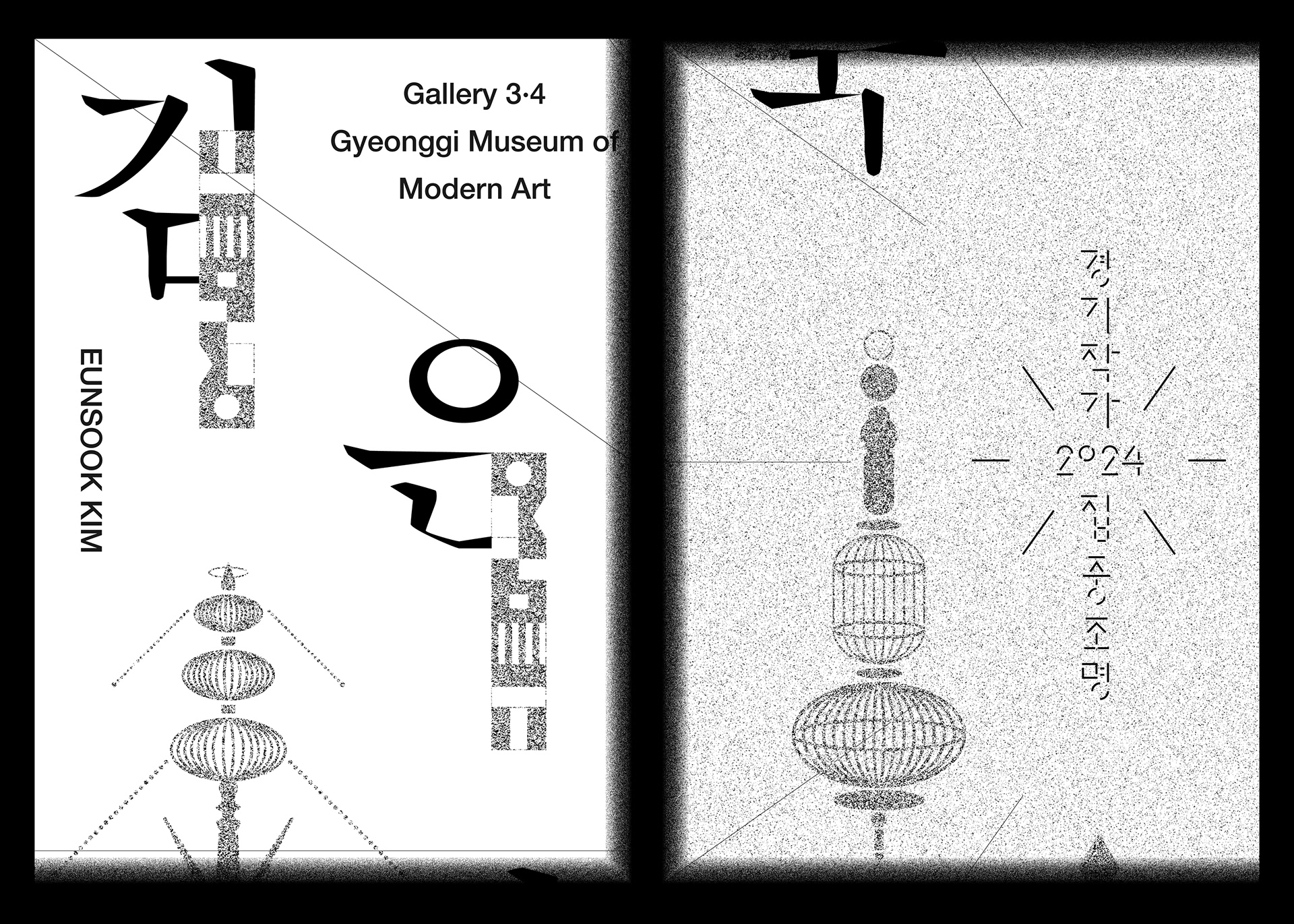
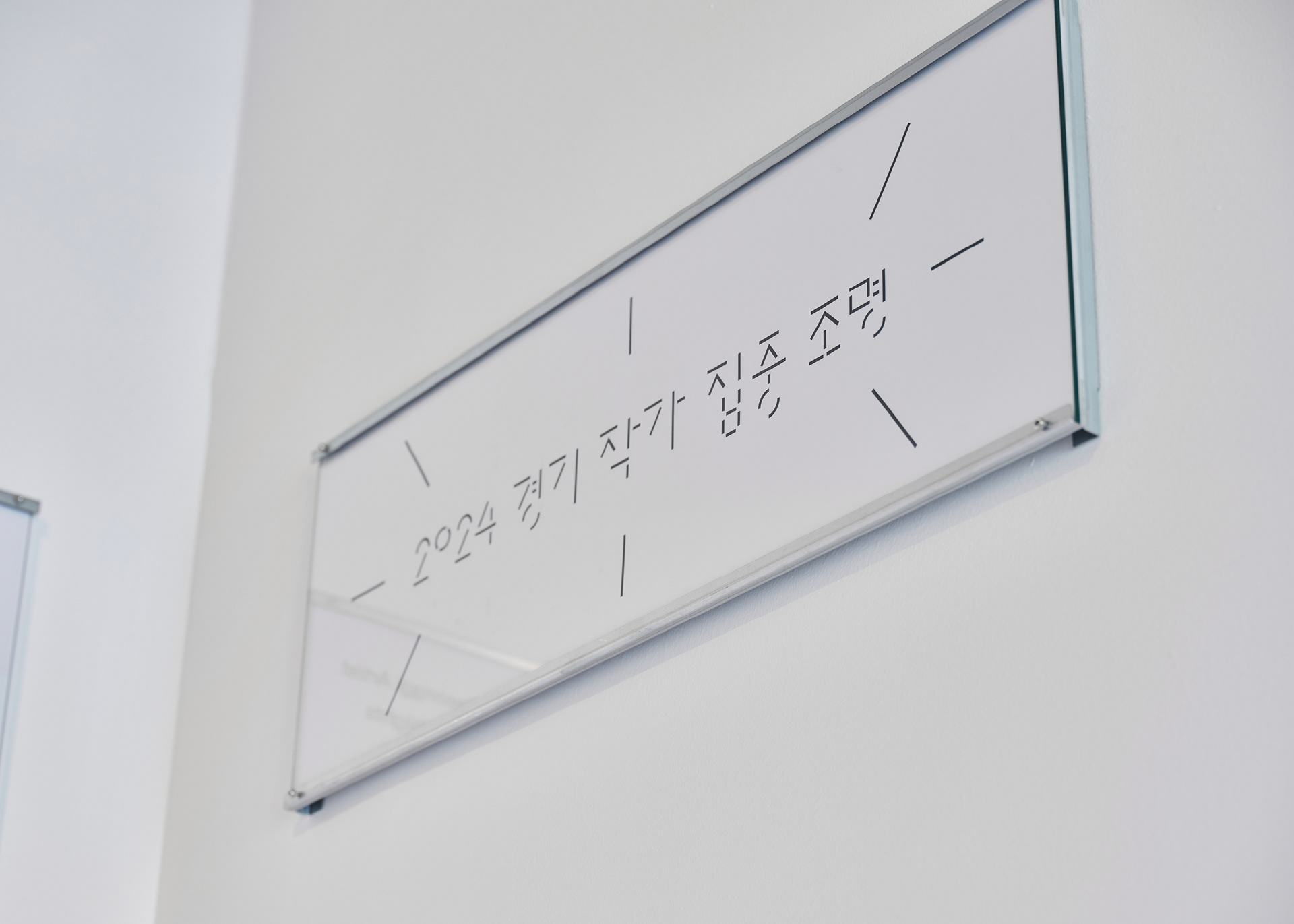
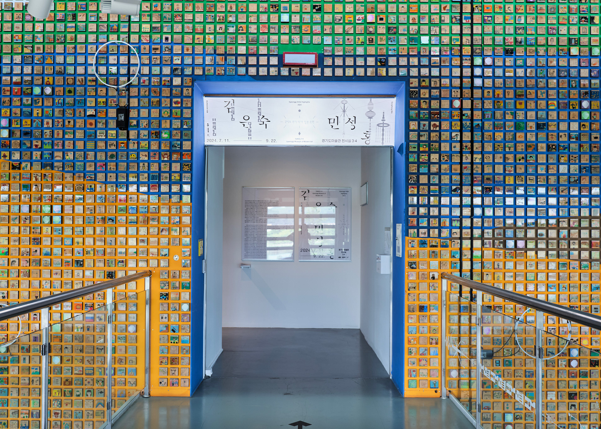
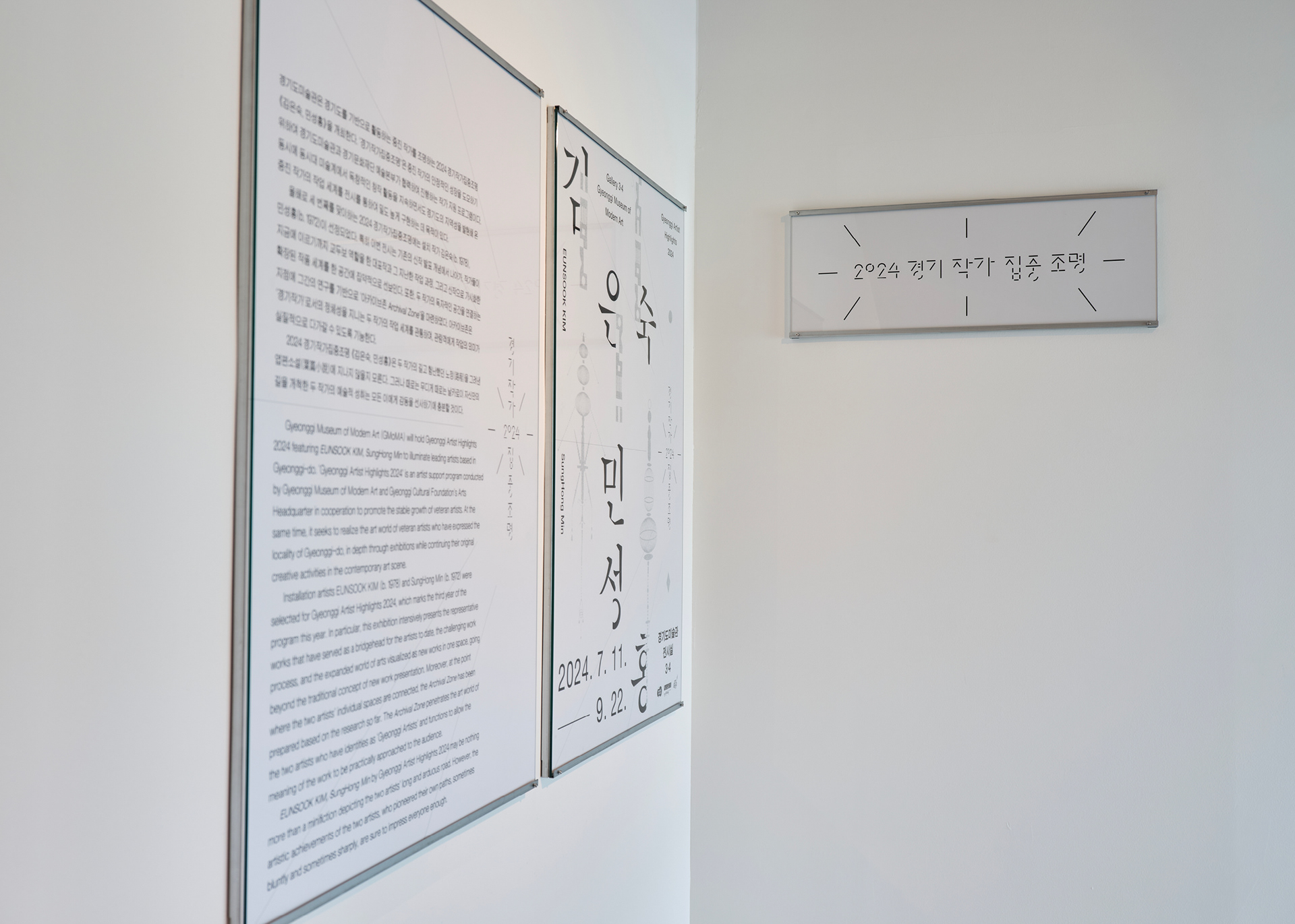
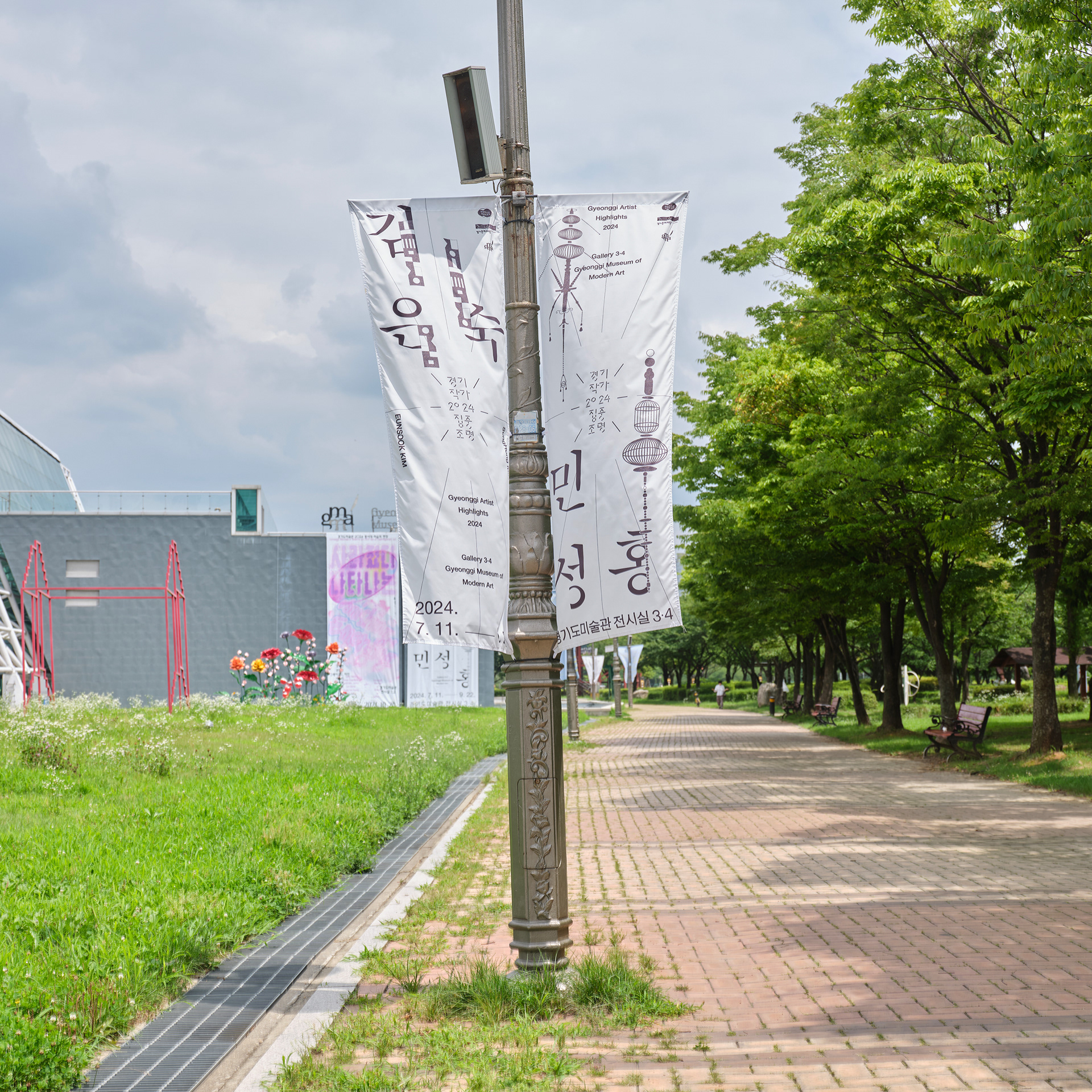
Converging Line Graphics : The graphic was composed utilizing the ‘line’—the most definitive element for increasing visual attention. Through an expansive presentation of lines converging to the center or radiating outwards, the concepts of ‘spotlight’ and ‘focus’ were visually manifested.
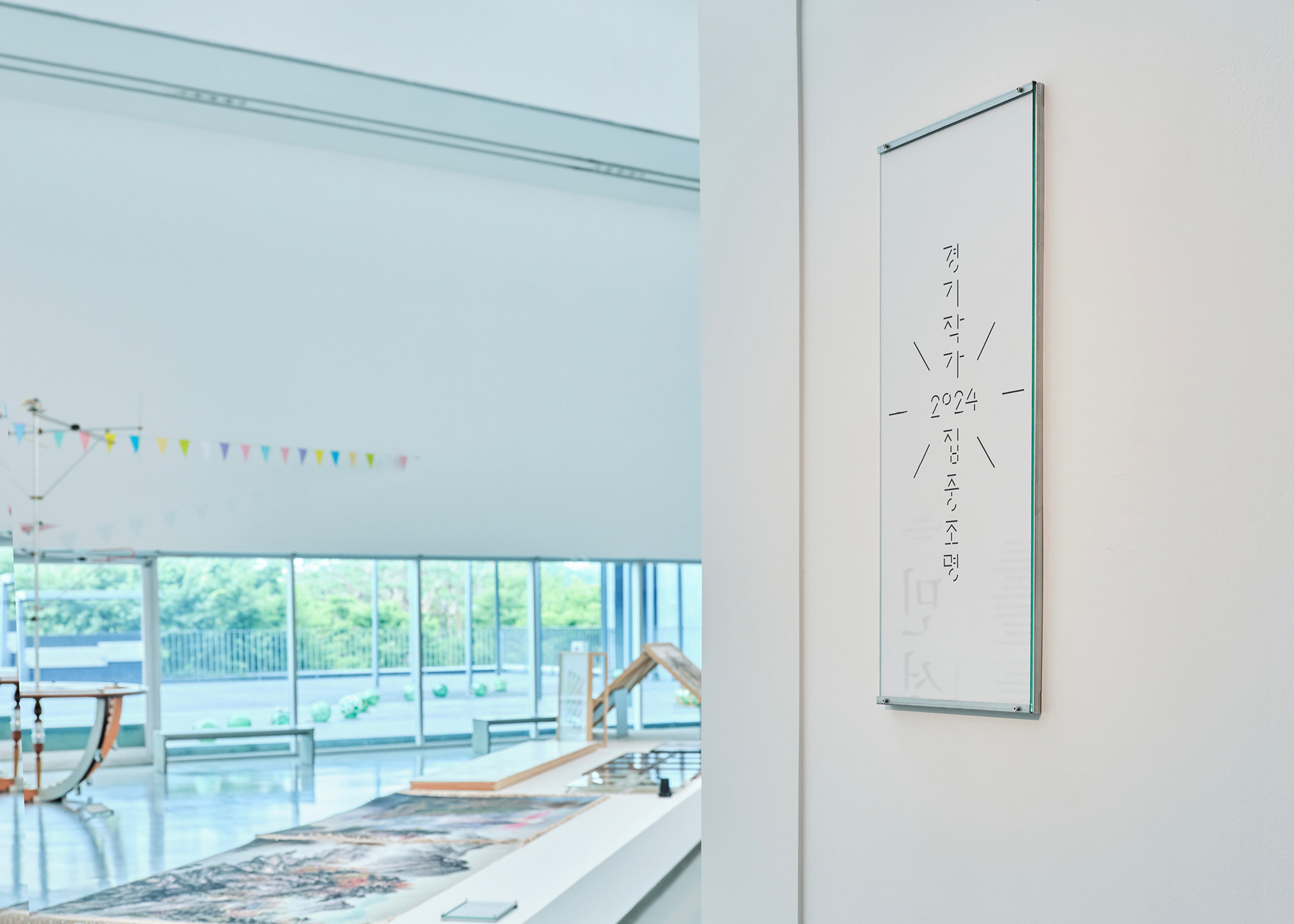
Graphic Typography : Considering the length of the title, we designed the identity by maximizing linear forms to emphasize visual aesthetics rather than simple readability. The strokes making up the consonants and vowels were intentionally fragmented into short lines, and converging line elements were placed around the exterior to strengthen the identity’s symbolism.
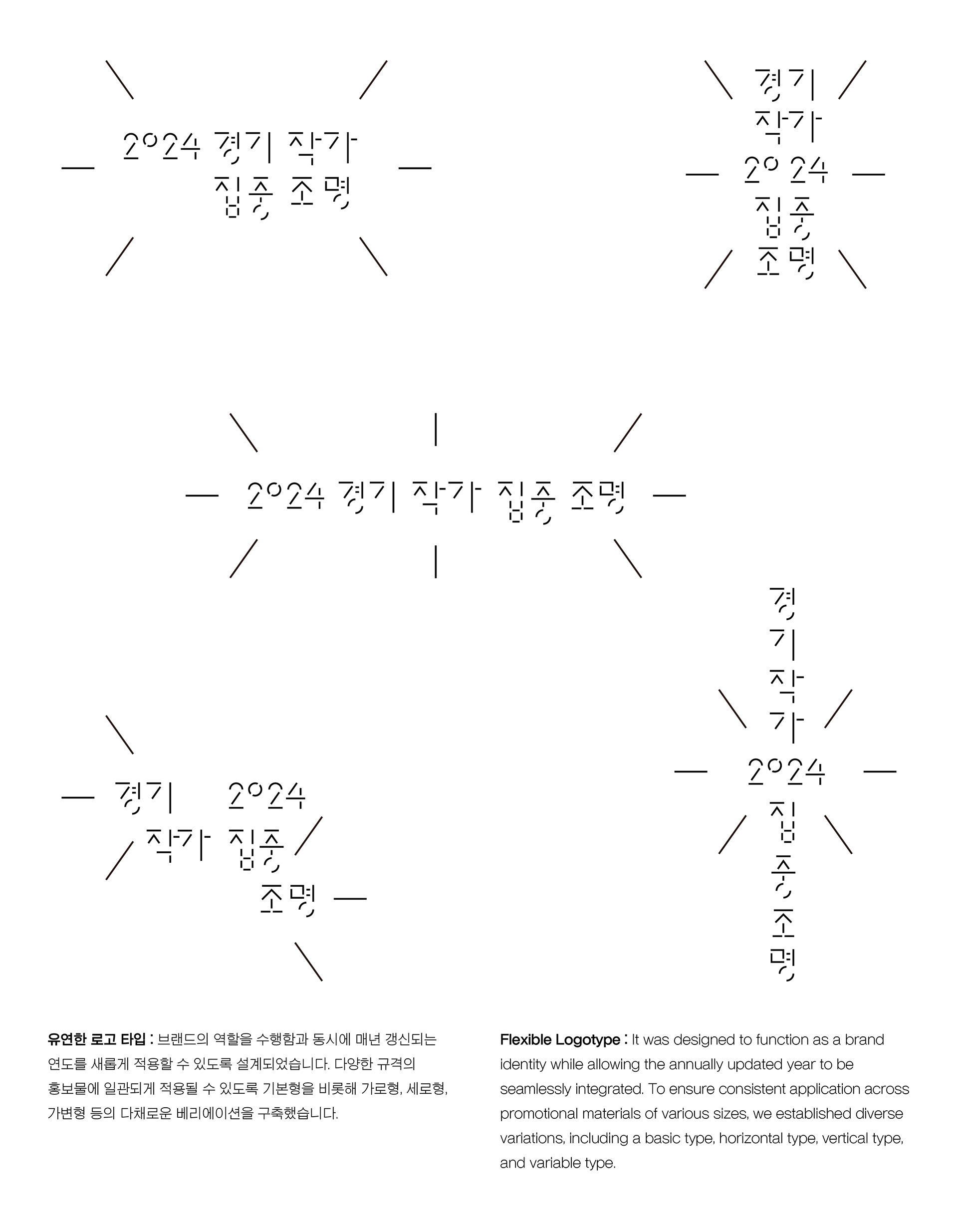
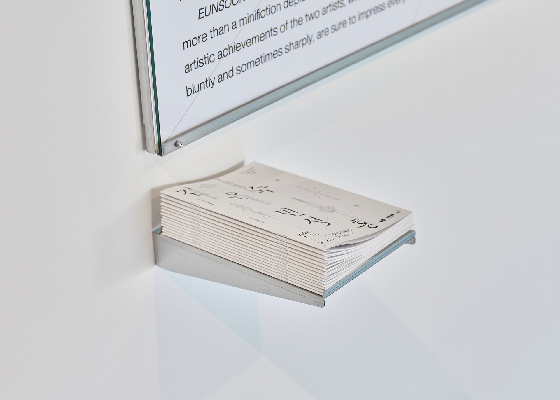
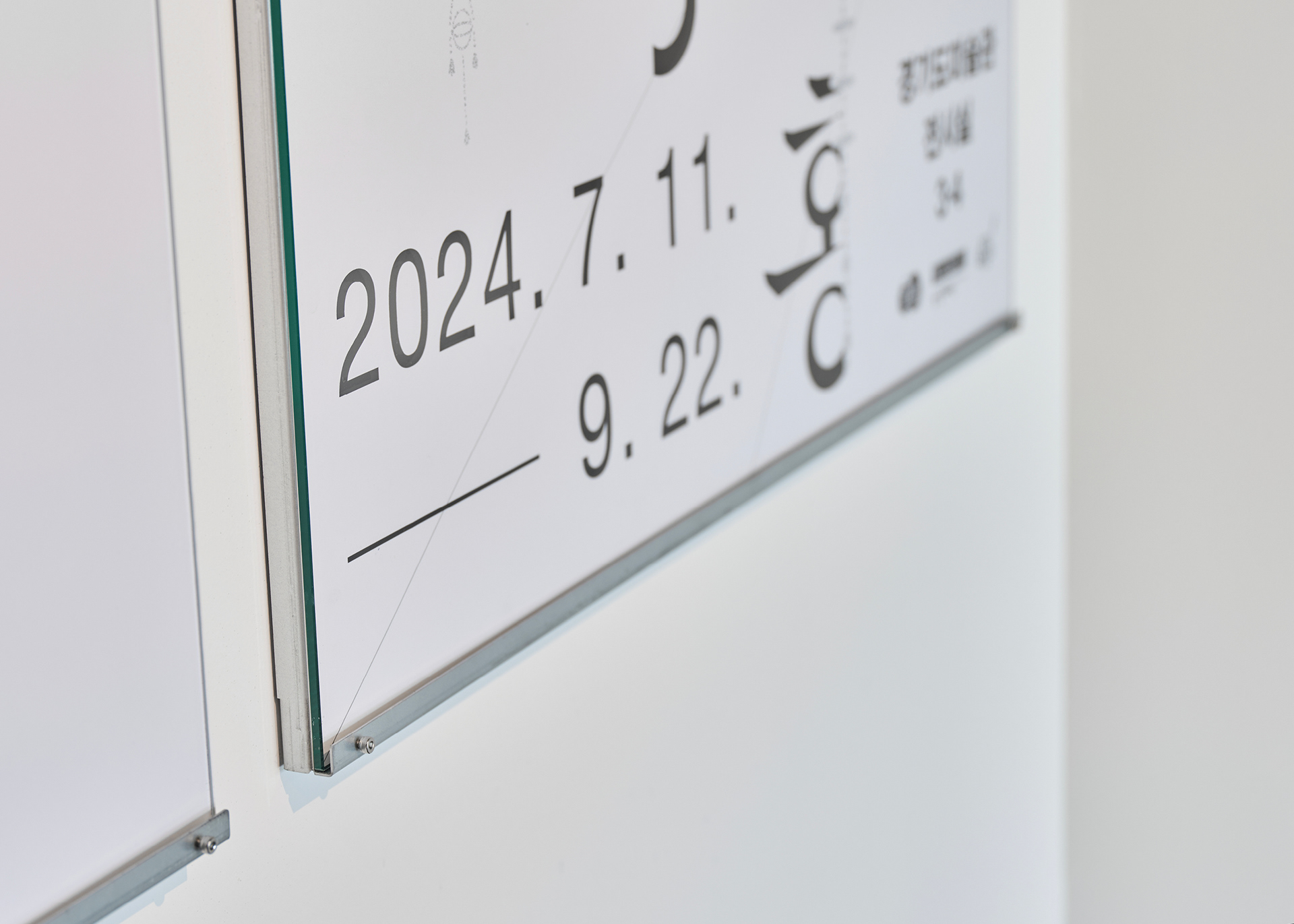
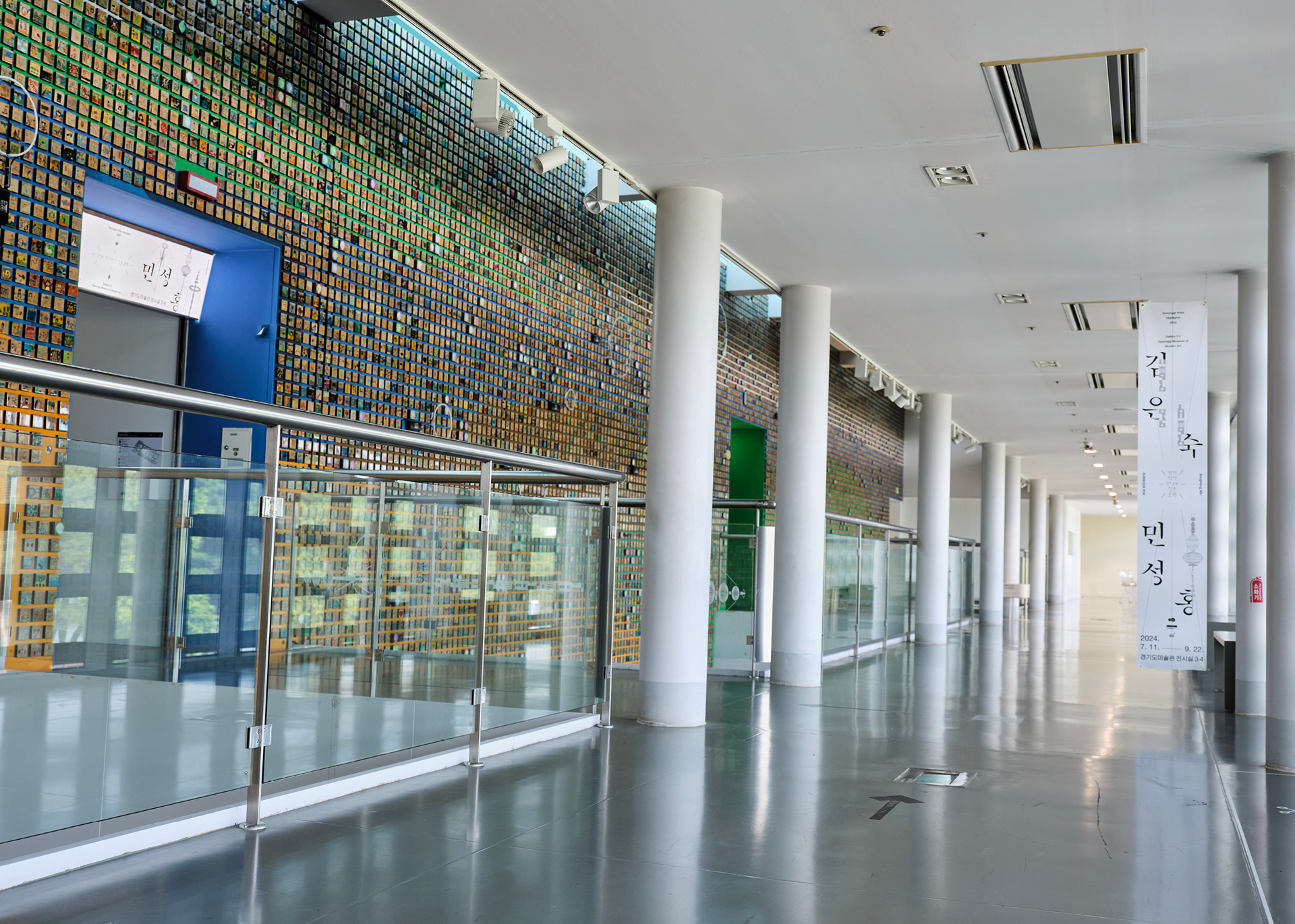
Flexible Logotype : It was designed to function as a brand identity while allowing the annually updated year to be seamlessly integrated. To ensure consistent application across promotional materials of various sizes, we established diverse variations, including a basic type, horizontal type, vertical type, and variable type.
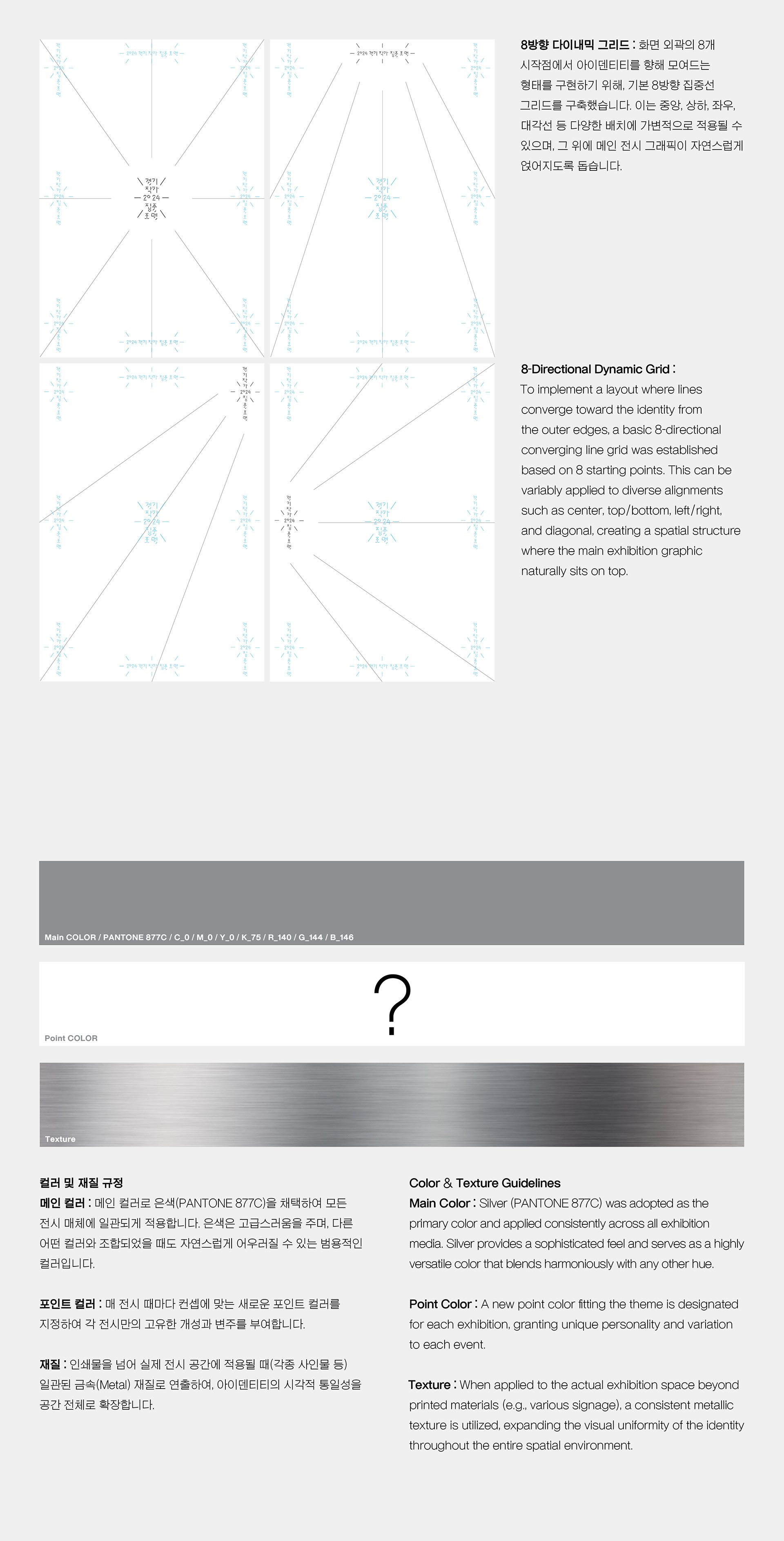
8-Directional Dynamic Grid : To implement a layout where lines converge toward the identity from the outer edges, a basic 8-directional converging line grid was established based on 8 starting points. This can be variably applied to diverse alignments such as center, top/bottom, left/right, and diagonal, creating a spatial structure where the main exhibition graphic naturally sits on top.
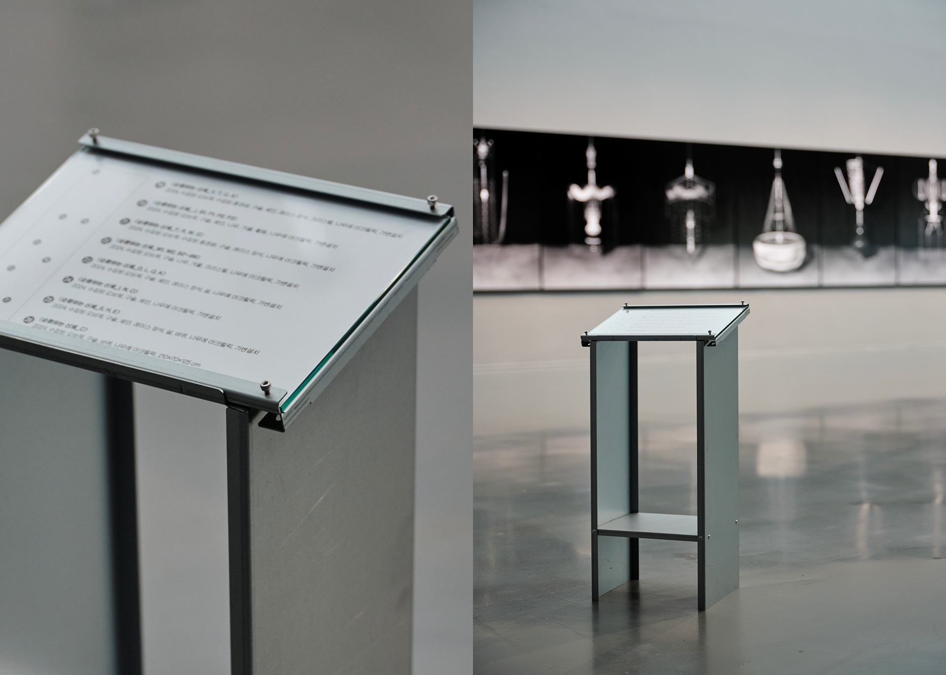
Color & Texture Guidelines Main Color : Silver (PANTONE 877C) was adopted as the primary color and applied consistently across all exhibition media. Silver provides a sophisticated feel and serves as a highly versatile color that blends harmoniously with any other hue.
Point Color : A new point color fitting the theme is designated for each exhibition, granting unique personality and variation to each event.
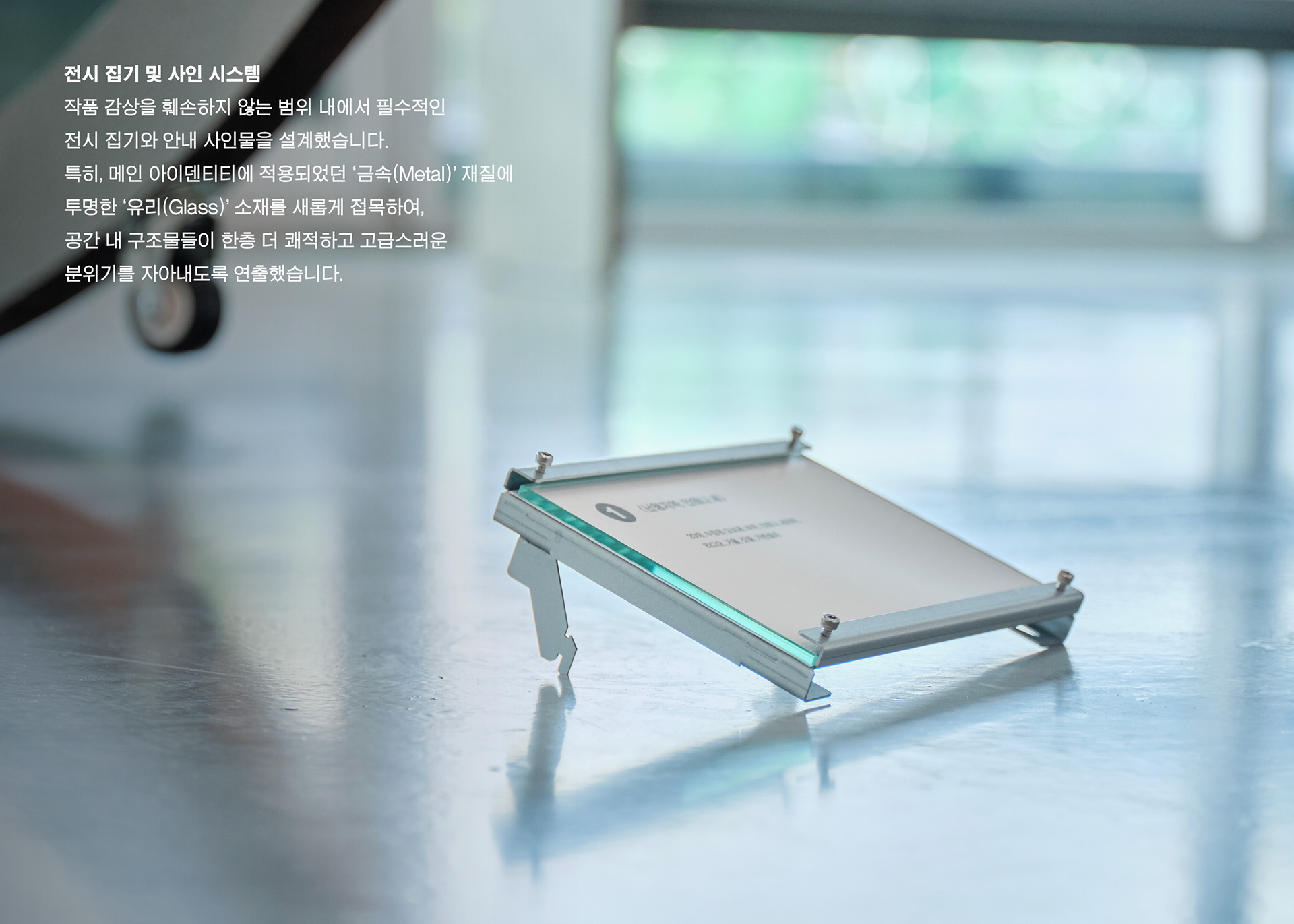
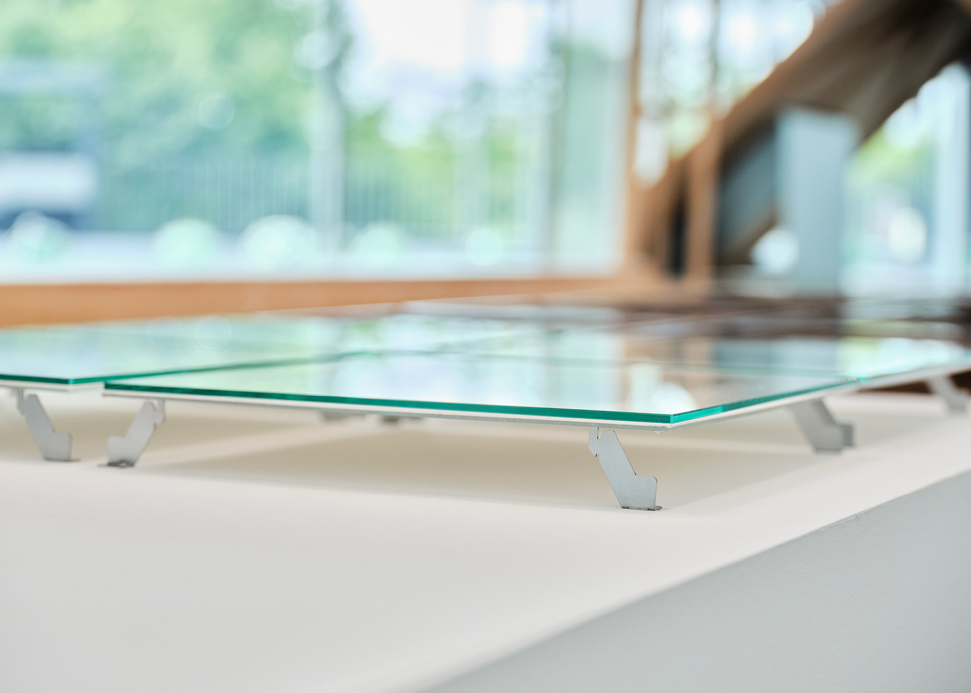
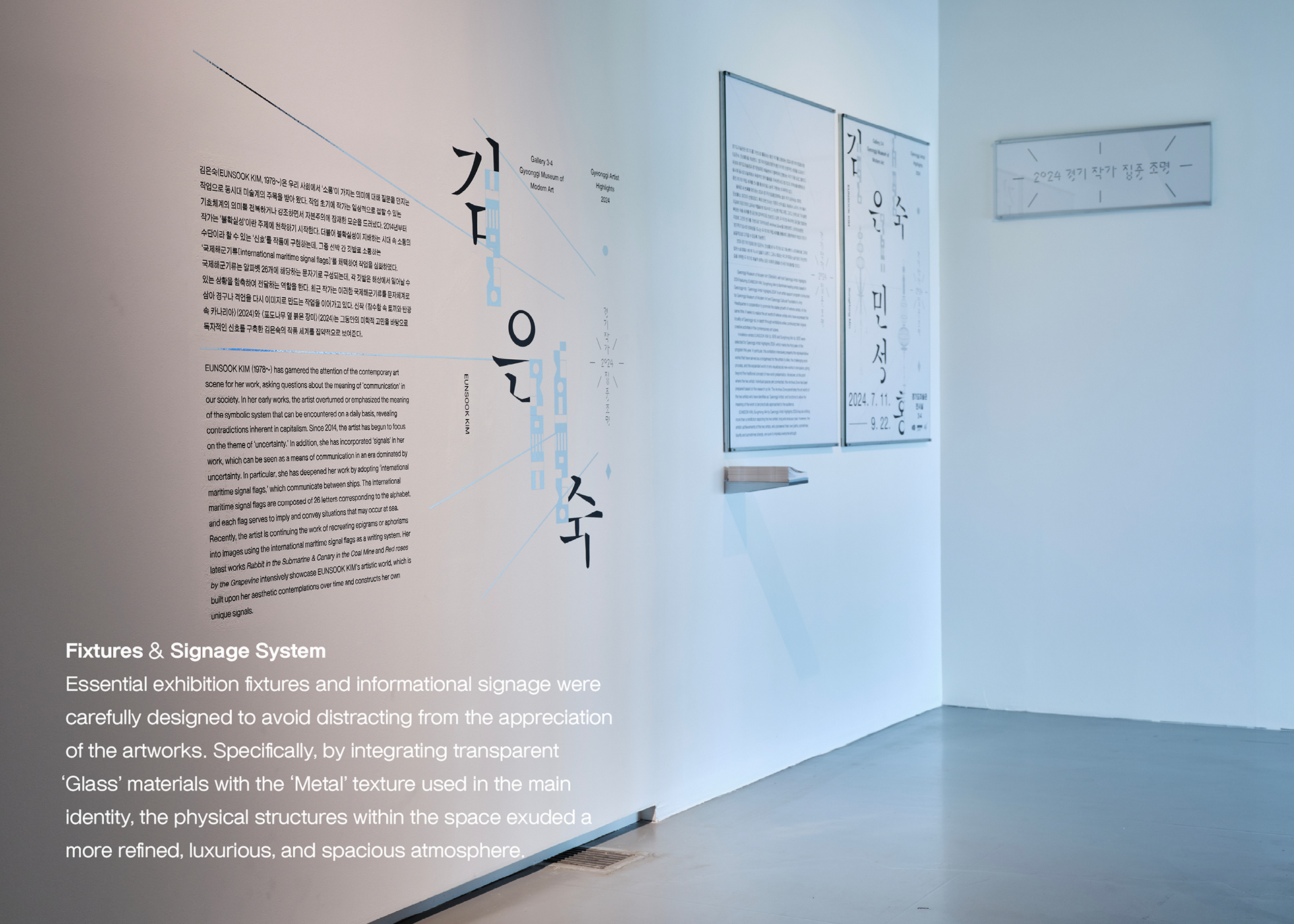
Texture : When applied to the actual exhibition space beyond printed materials (e.g., various signage), a consistent metallic texture is utilized, expanding the visual uniformity of the identity throughout the entire spatial environment.